Hi, I'm Oluwabukola Elegbede a UX Designer with 6+ years spanning brand communication and user-centred design. Recent contracts at Accenture Song and Sainsbury's. MA User Experience graduate, University of the Arts London.
My work spans UX research grounded in empathy and real-world insights and visual design for major global brands.
Research-driven projects exploring trust, communication, sustainability and human connection through participatory methods.
View UX Work →Creative advertising and brand work for major global consumer brands translating briefs into compelling visual stories.
View Visual Work →
Visual communication cards helping patients express pain beyond words increasing trust between patients and healthcare professionals.
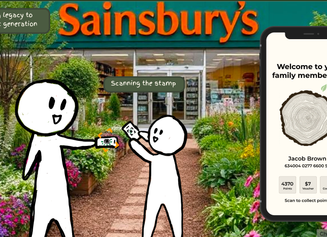
A multi-generational loyalty scheme run by plants reimagining reward systems through reciprocity and sustainable behaviour.
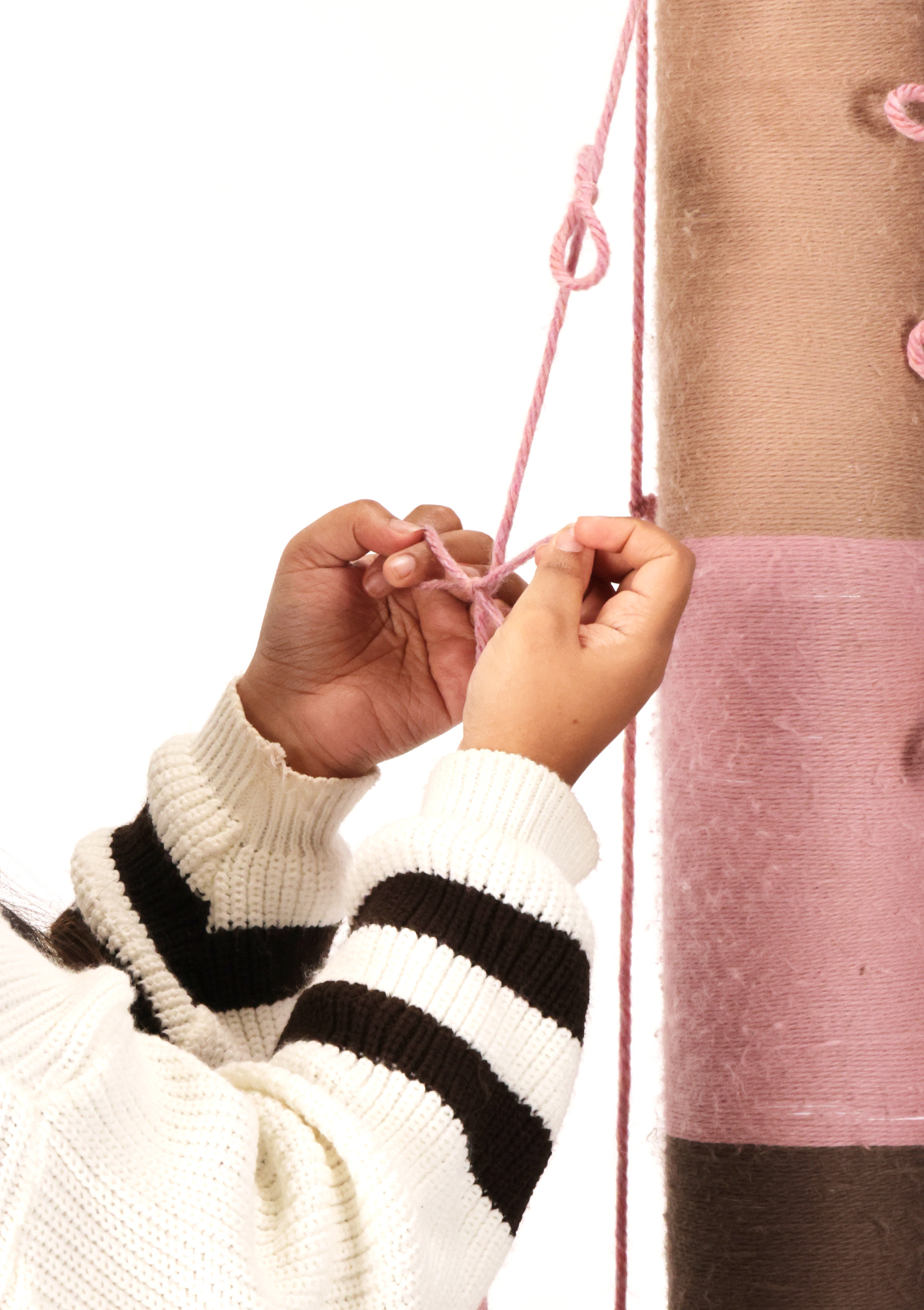
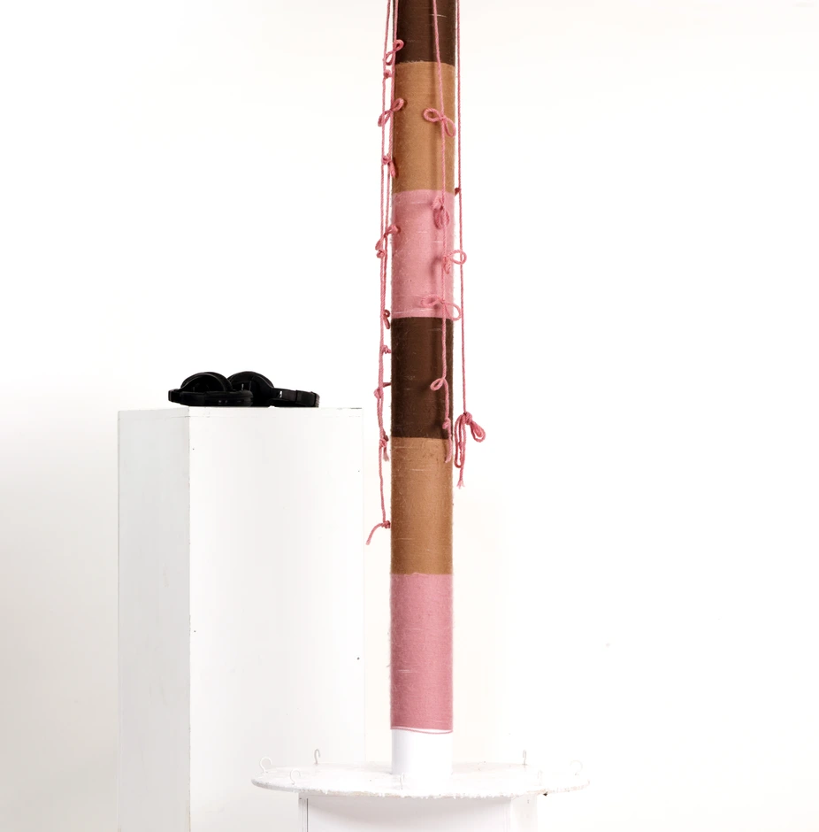
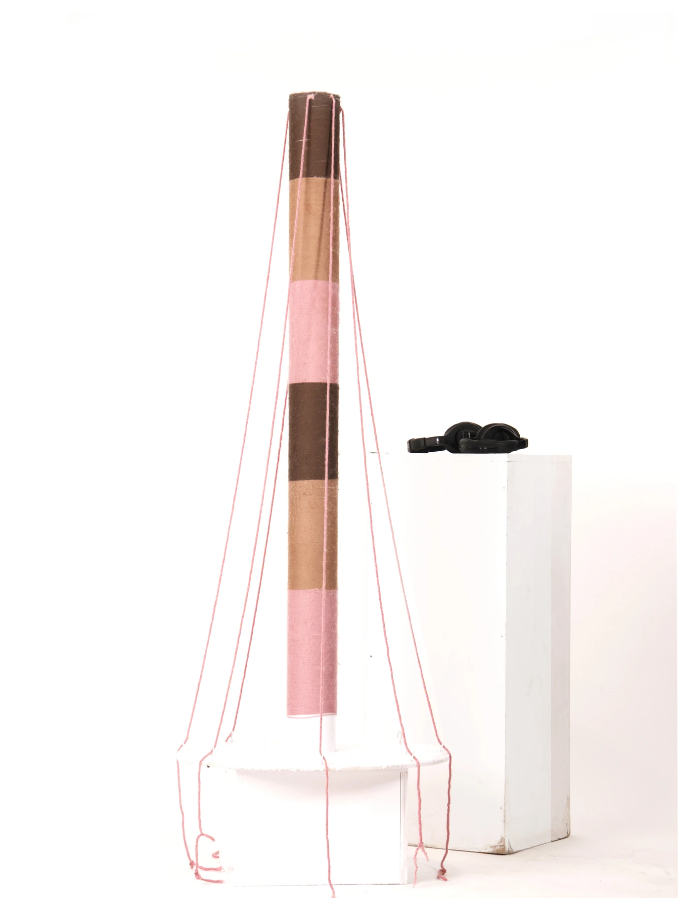
Humanising international student migration data through a Quipu-inspired physical installation and emotional audio storytelling.
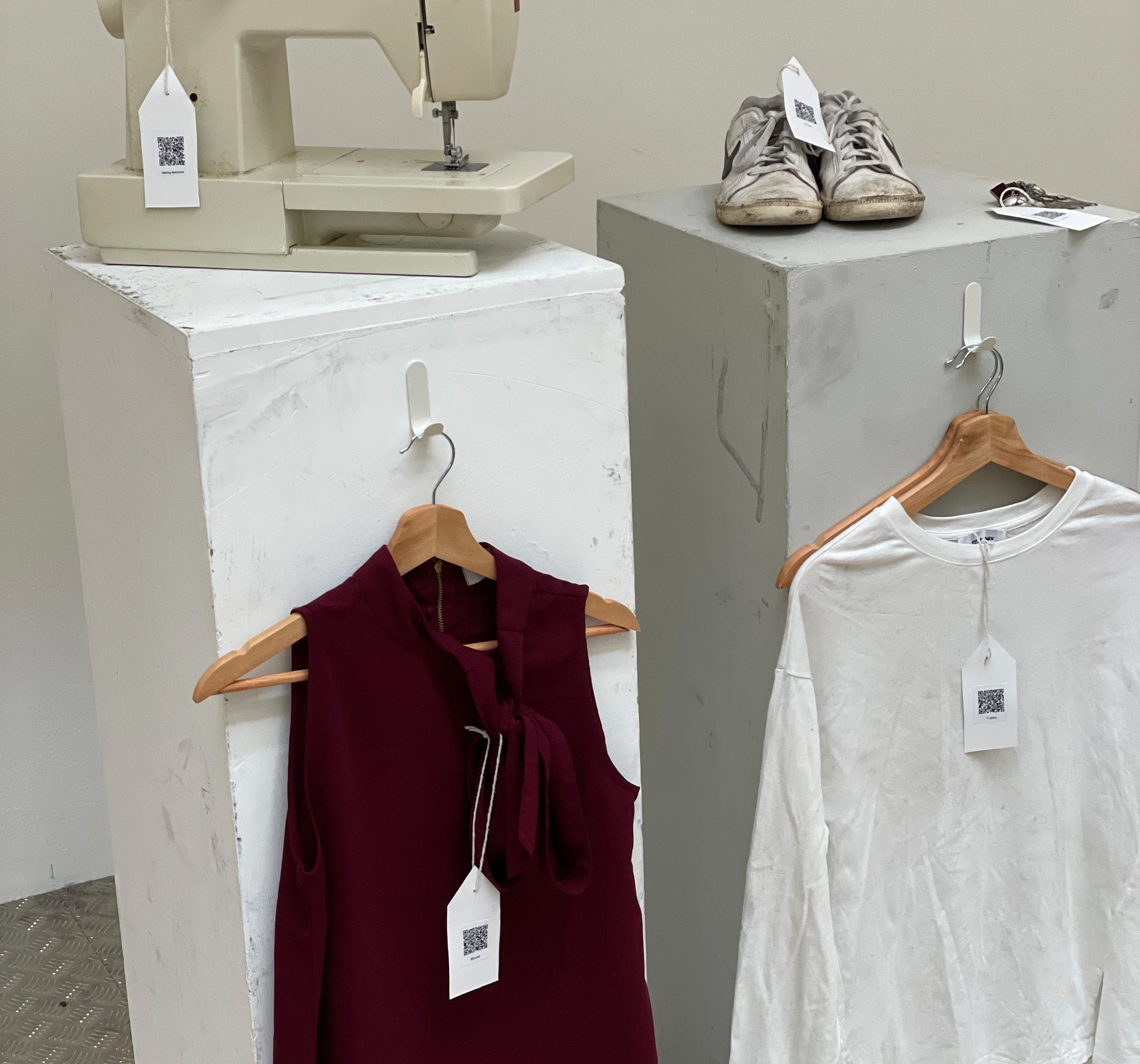
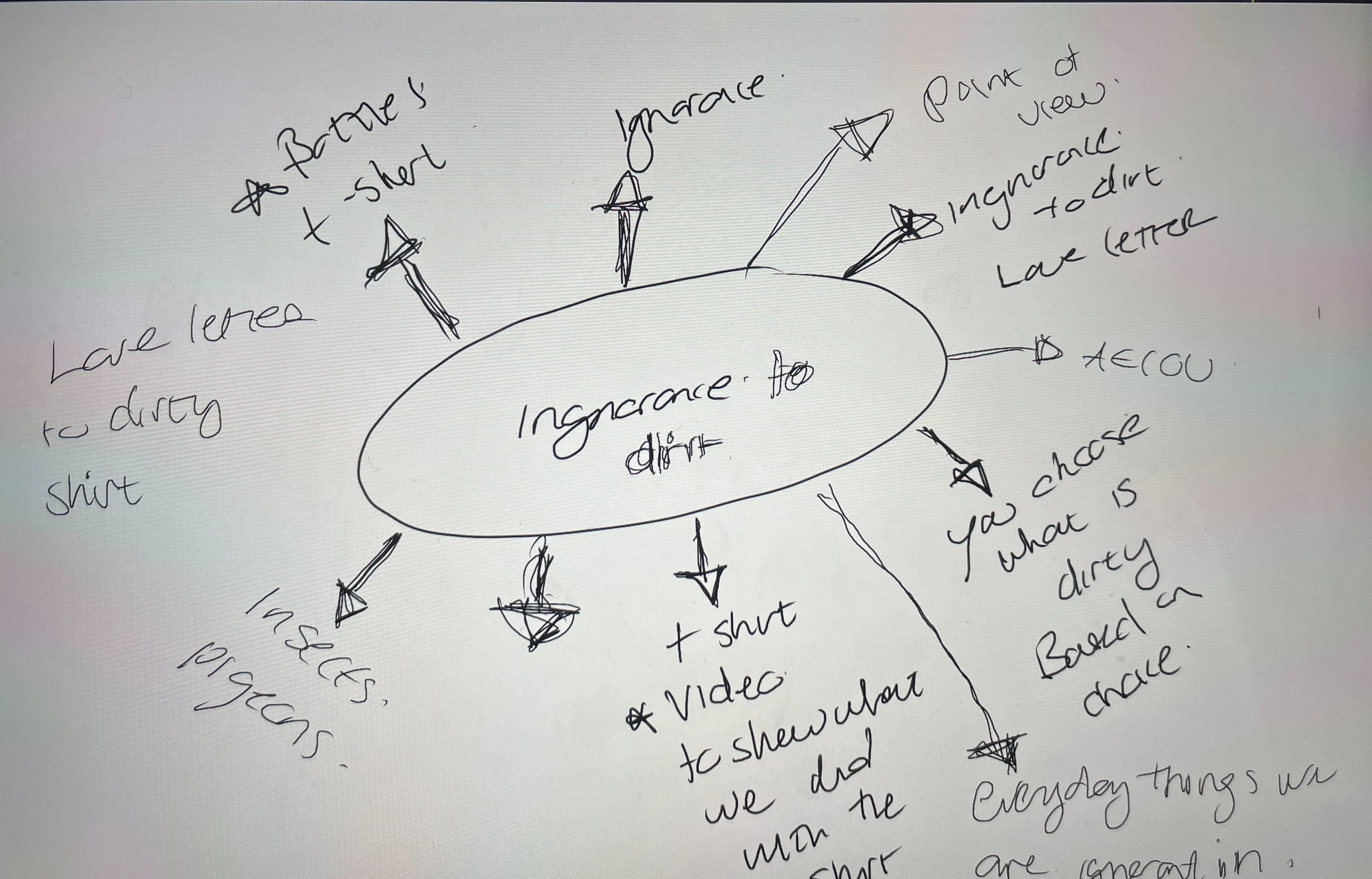
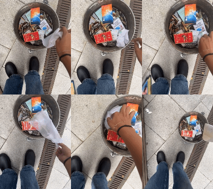
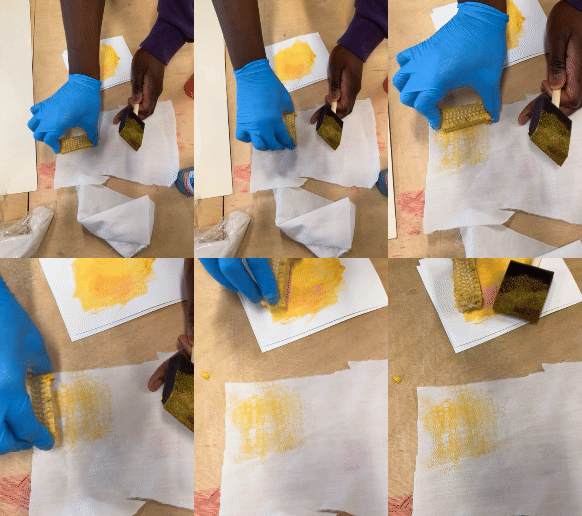
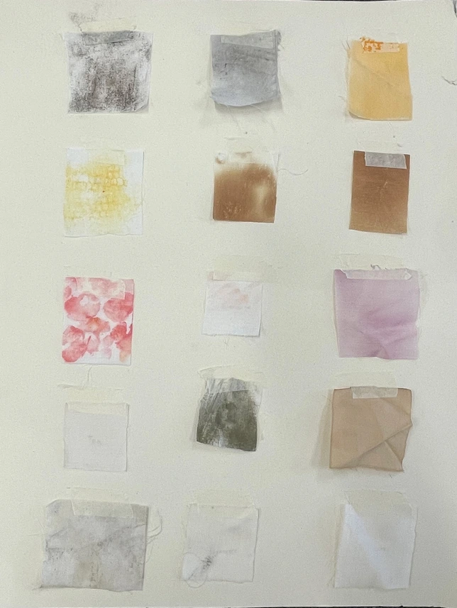
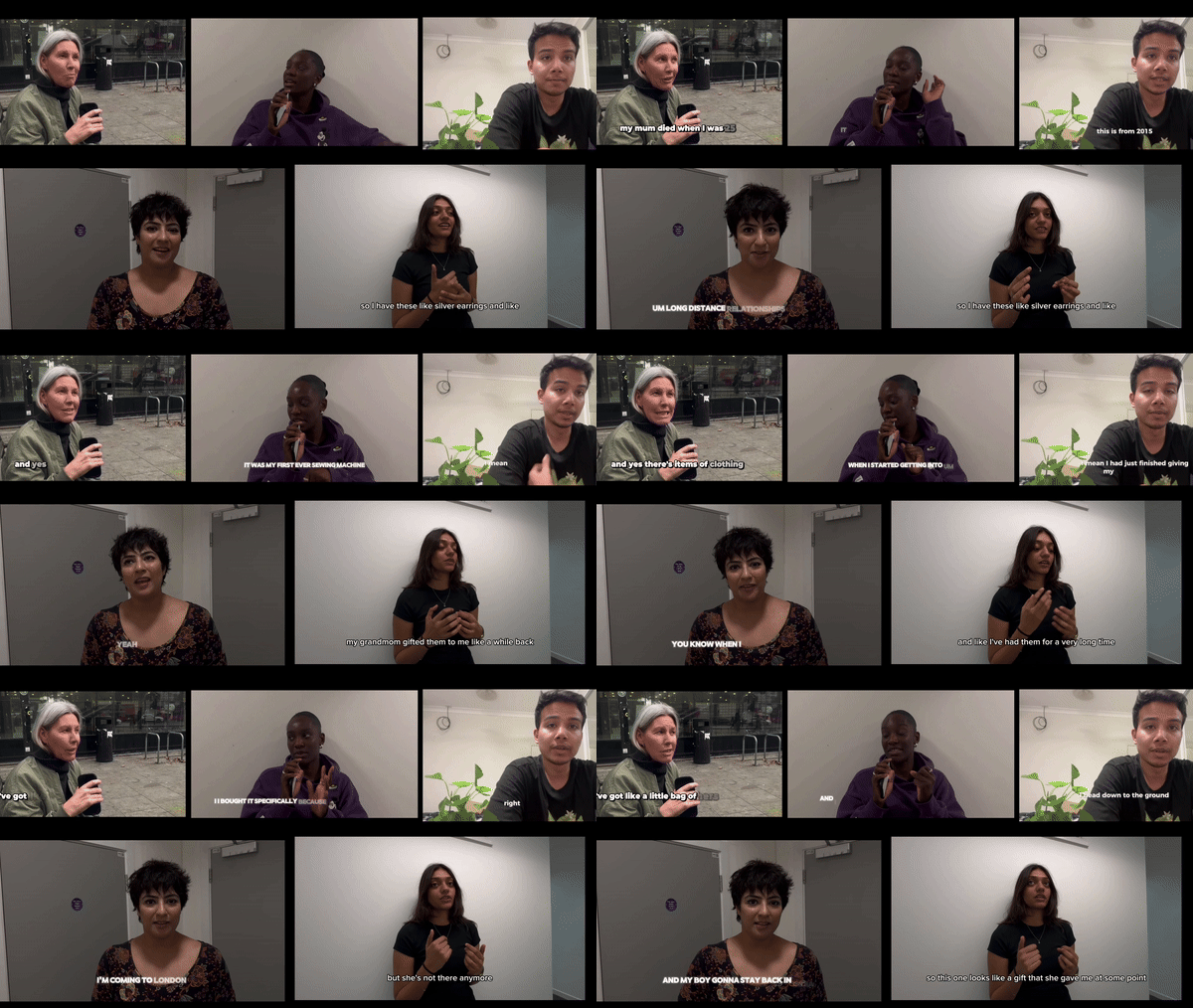
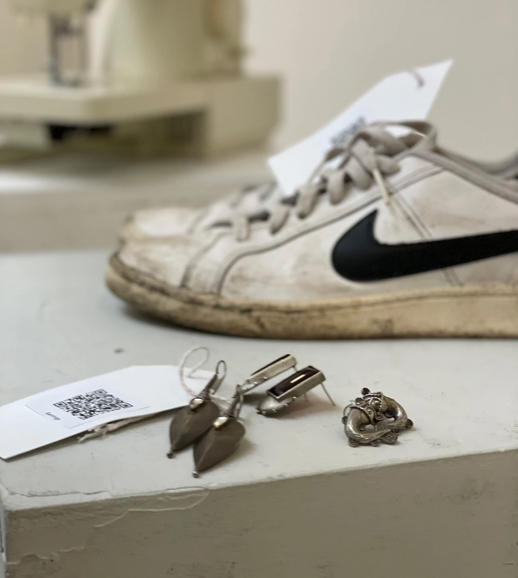
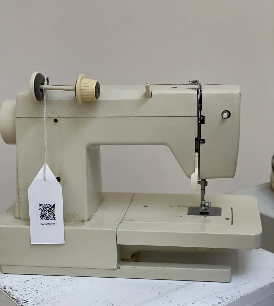
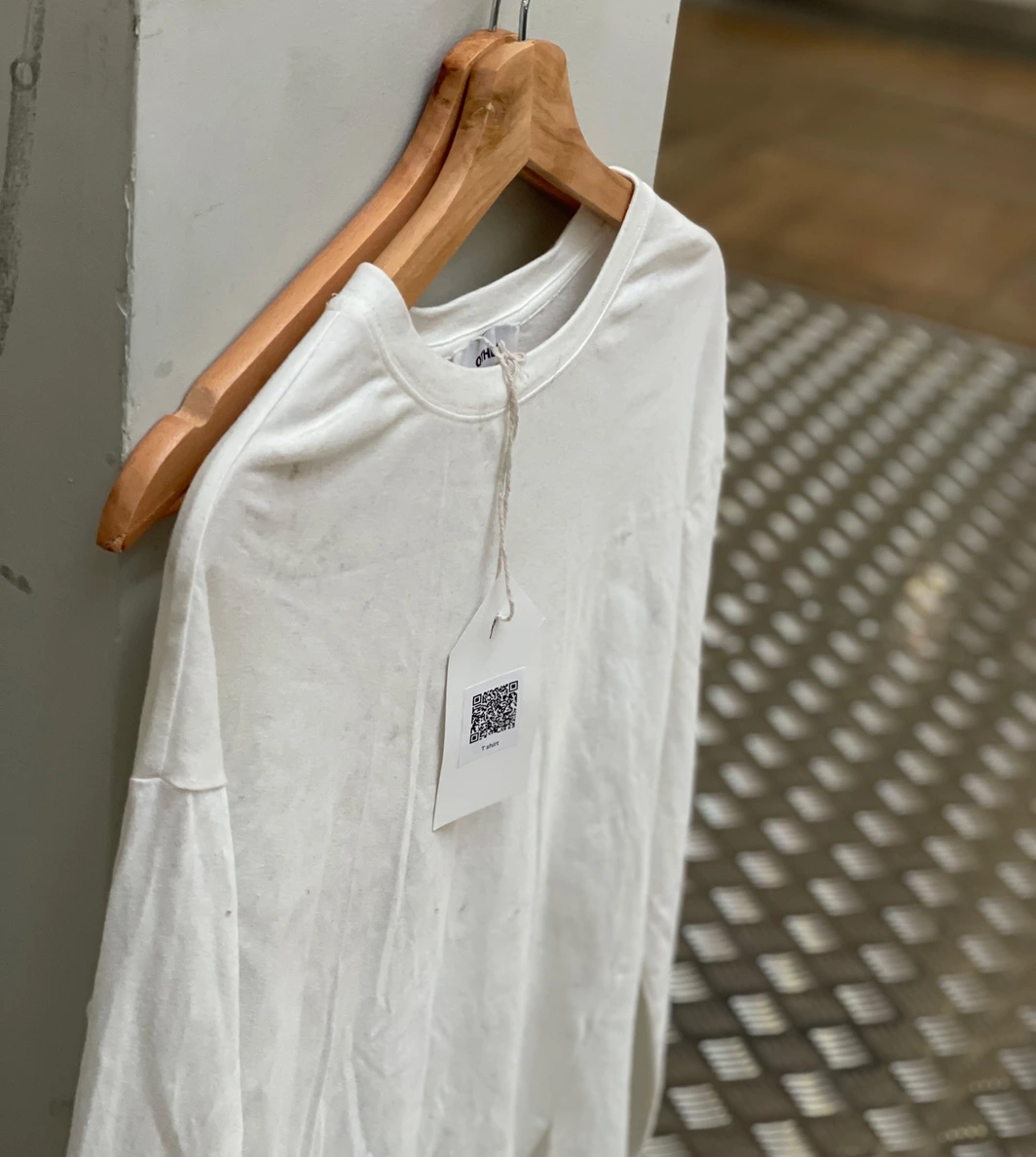
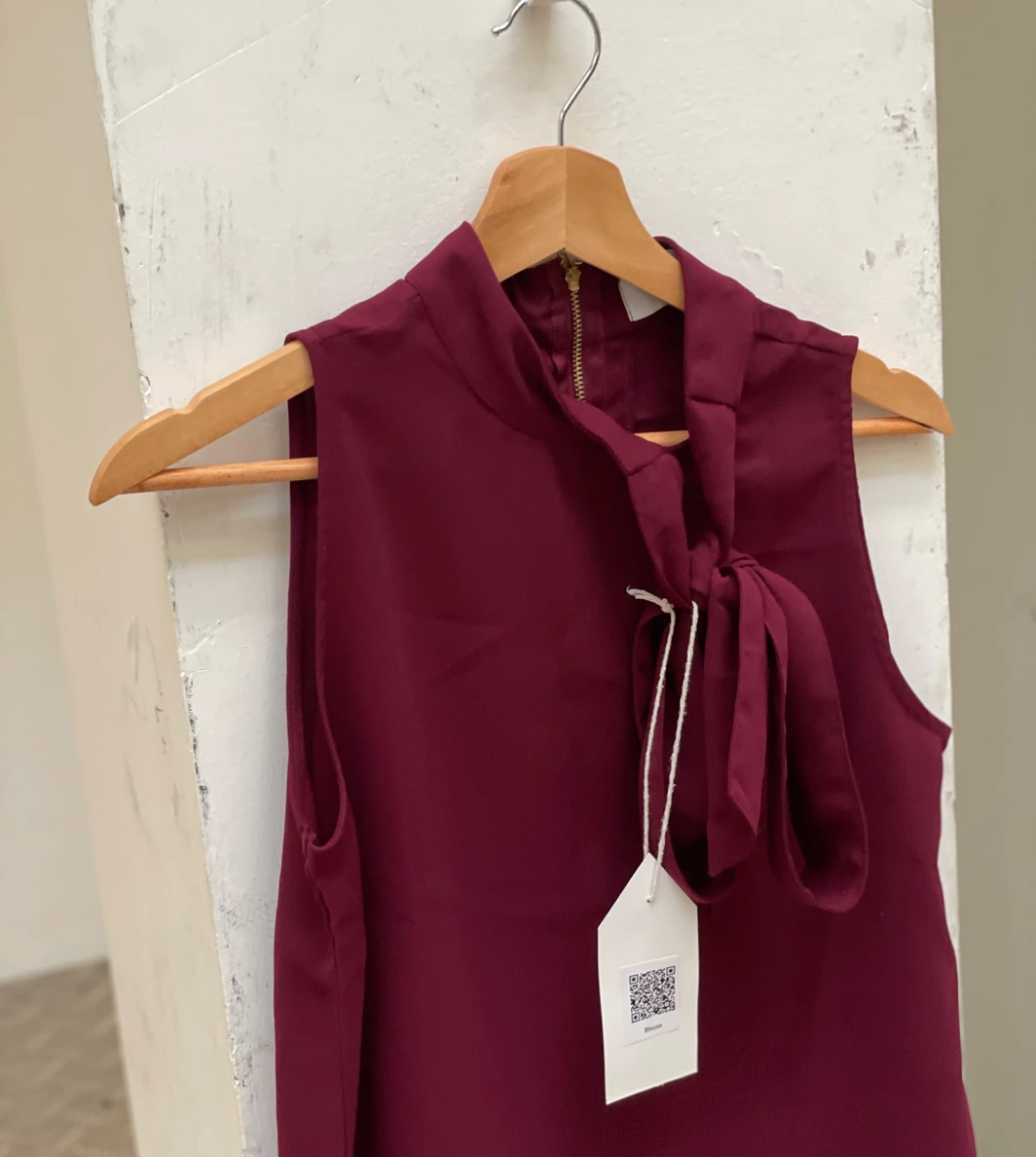
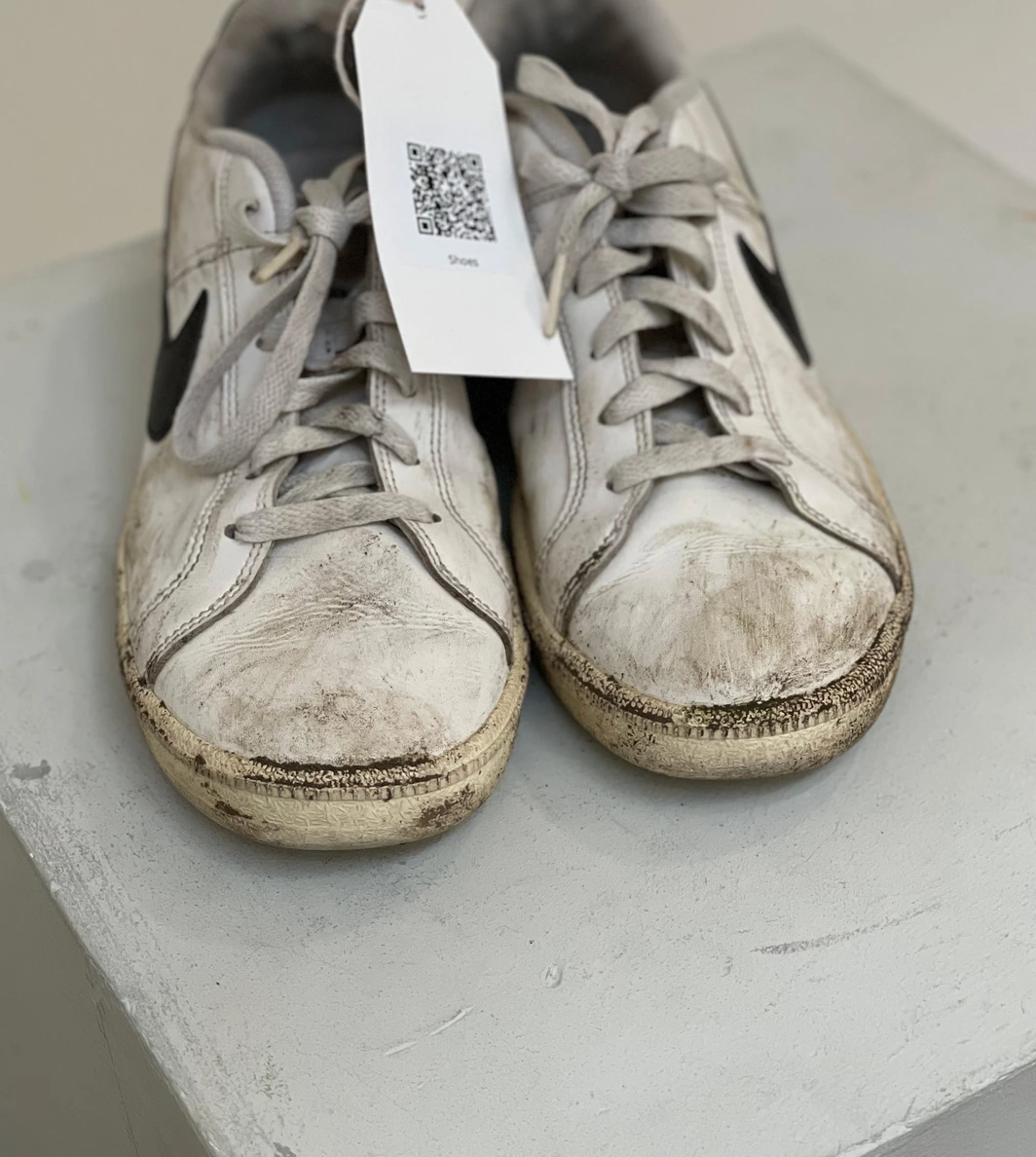
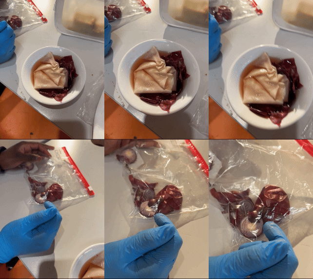
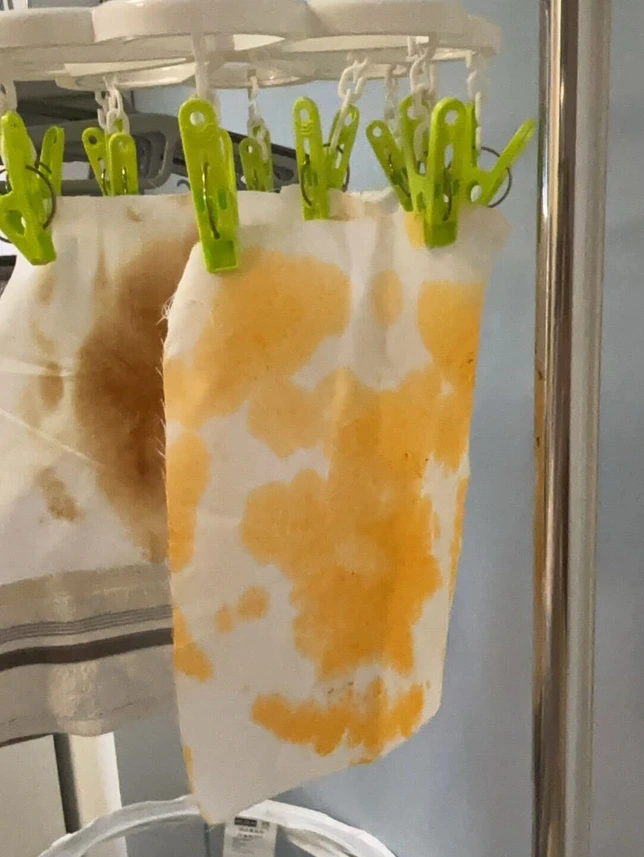
An interactive exhibition revealing emotional stories in worn objects challenging perceptions of "dirt" and value in fast fashion.
I'm Oluwabukola Elegbede a UX Designer with 6+ years across brand communications and user-centred design, with recent contract experience at Accenture Song and Sainsbury's. My practice is grounded in empathy, research, and the belief that good design starts with listening.
Before completing my MA User Experience Design at UAL London, I spent years as a Senior UX & Visual Designer at Wild Fusion and a Designer at Noah's Ark Communications crafting campaigns for OMO, Lipton, Gordon's Gin, Knorr and more.
I'm skilled in end-to-end UX from research and usability testing to prototyping and design systems and have a strong track record of translating evidence into accessible, impactful experiences across retail, FMCG, and consulting sectors.
I'm open to UX research roles, design contracts, and creative collaboration. If you're working on something worth solving, I'd love to hear about it.
Increasing trust and collaboration between healthcare professionals and patients through visual communication.
Our brief was to design an interaction between a patient and their healthcare professional that promotes trust and collaboration. The project was completed in partnership with Accenture Song as part of the UAL-LCC contract programme.
To deepen our understanding, my team and I conducted interviews with both healthcare professionals and patients, gathering insights about their experiences with the NHS. We organised the findings into core themes: systemic challenges, misinformation and distrust, and opportunities to rebuild trust.
Our research revealed that many patients felt their GP appointments were rushed and that they weren't truly being heard. Healthcare professionals, on the other hand, expressed concerns about patients arriving with preconceived self-diagnoses influenced by Google and social media. This disconnect created frustration on both sides and ultimately contributed to a breakdown of trust.
To better understand the user experience, we created a journey map that visualised the end-to-end process from booking an appointment to receiving treatment.
"Patients felt unheard. Clinicians felt undermined. The gap wasn't medical it was communicative."
During a brainstorming session, we explored the idea of displaying a visual representation of the patient's body on a screen that both the doctor and patient could view simultaneously. This would allow patients to describe their feelings by pointing to the visual, and help doctors explain potential causes more clearly.
While exploring the shared screen concept, we realised that developing a fully interactive AI-integrated system would require significant technical resources. To make our solution more accessible, we decided to explore a more tactile, low-tech alternative that still focused on visual communication.
I proposed turning the concept into a deck of visual cards, each combining imagery with descriptive keywords. This would allow patients to select cards that best represent their pain and use them as a communication aid during consultations.
To guide our design, we ran a short survey asking people which common pains they struggle to describe. 47% of respondents said they found it difficult to describe stomach aches, making it an ideal starting point for prototyping the card system.
In developing the pain communication cards, we aimed to create a simple, visual system that could help patients express the type of stomach pain they were experiencing, especially when words were hard to find. We drew from the McGill Pain Questionnaire, which helped us categorise pain into three main types:
One key insight from our survey was that many patients use metaphors to describe pain (e.g., "It feels like something twisting"). These metaphors were powerful, so we incorporated them to make the cards feel more relatable and emotionally accurate.
The back of each card features only the icon, with no text. This allows patients to choose based on pure instinct what visually connects with how they're feeling, without the influence of labels or descriptions.
To ensure the cards are accessible to everyone, including people with colour vision deficiencies such as Tritanopia (blue-yellow colour blindness), we designed the icons with high contrast. This means each icon remains recognisable regardless of a person's ability to perceive certain colours. We tested across Protanopia, Tritanopia, Deuteranopia, and Achromatopsia.
To assess the effectiveness of our pain communication cards, we carried out a series of role-playing tests. My team members and I acted as general practitioners (GPs), while participants took on the role of patients. We tested three versions of the cards. Coincidentally, two of the participants were experiencing stomach pain at the time of the test, providing a unique opportunity to observe how the cards performed in a real, in-the-moment context.
To gain a clinical perspective, we interviewed two medical doctors with different levels of experience.
"It is very easy to lose a patient's trust if you immediately dismiss their self-diagnosis. These cards help build trust early in the consultation, enabling more open and respectful communication. They're especially helpful for patients who face language barriers."
Doctor with 27 years of consultation experience"Pain is deeply subjective. When a patient says they're in pain, you have to believe them. Tools like these cards can help clarify and validate the type of pain being experienced, reducing miscommunication and improving care. This is especially true for conditions like endometriosis."
Doctor with 25 years of consultation experienceAside from the one-on-one consultation, another area where these cards could be highly beneficial is in supporting women with endometriosis a condition that involves chronic and often misunderstood pain. The cards can empower patients to more accurately identify, describe, and communicate their pain, which may result in more compassionate and effective diagnosis and treatment.
I'm open to UX research roles, design contracts, and creative collaboration.
The goal of this project was to explore how a loyalty experience could be designed around reciprocity, where plants reward humans for eco-friendly behaviours, encouraging a more emotional and mutual relationship between people and nature.
The goal of this project was to explore how a loyalty experience could be designed around reciprocity where plants reward humans for eco-friendly behaviours, encouraging a more emotional and mutual relationship between people and nature.
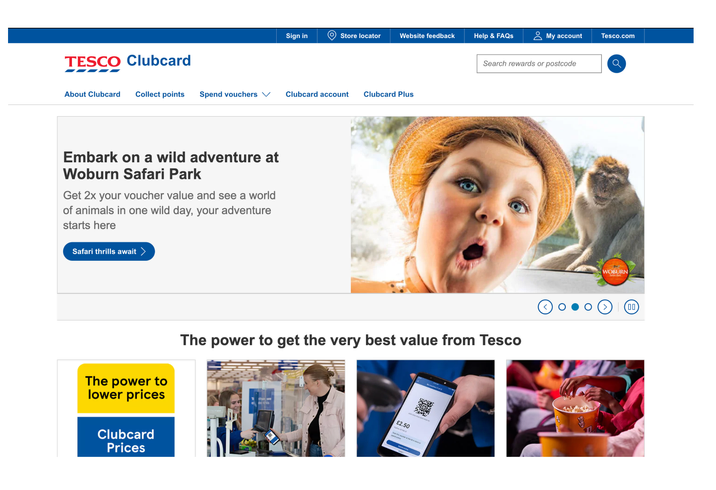
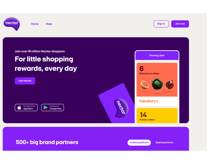
To establish a baseline, we analysed how current UK loyalty programmes function. We reviewed Lidl Plus, Sainsbury's Nectar, Asda Rewards, and Tesco Clubcard, focusing on three areas: how users earn rewards, how those rewards are structured, and how users interact with each system.
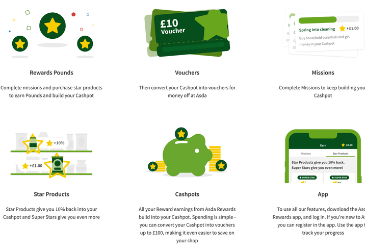
Asda Rewards and Tesco Clubcard two of the programmes we analysed as part of our competitive review.
We realised that Asda uses a cashback model, which many users prefer due to its simplicity and immediate value. Despite differences in execution, all programmes shared a common requirement: users must take a deliberate action such as making a purchase or scanning a card before receiving any reward.
This highlighted a clear pattern in existing loyalty systems: value is always earned after consumption or transaction.
Sainsbury's Nectar the primary client partner for this brief.
As part of our secondary research, I came across Braiding Sweetgrass by Robin Wall Kimmerer. The book introduces reciprocity as a core principle giving back to the Earth in return for what is taken. This perspective challenged the transactional logic of conventional loyalty schemes and became a key conceptual driver for the project.
It prompted a shift in our design focus: rather than rewarding consumption, how might a loyalty system reward care, stewardship, and sustainable behaviour?
"Rather than rewarding consumption, how might a loyalty system reward care, stewardship, and sustainable behaviour?"
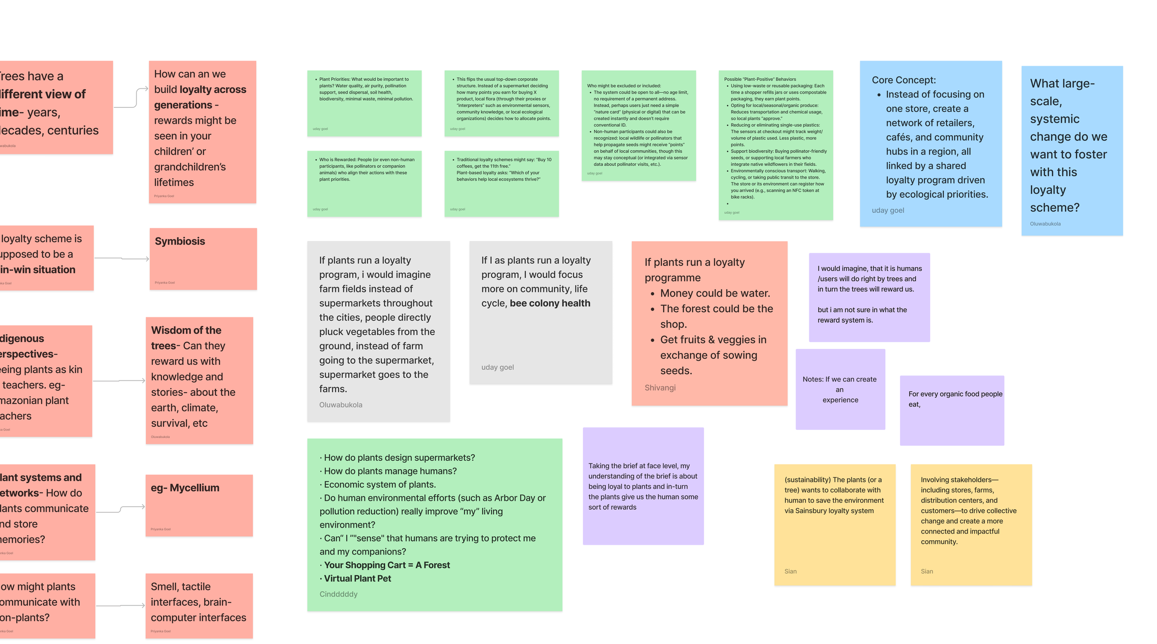
Based on these insights, we conducted a brainstorming session to define our design direction. This resulted in the following guiding questions:
Our brainstorming boards exploring what a loyalty system run by plants could look like.
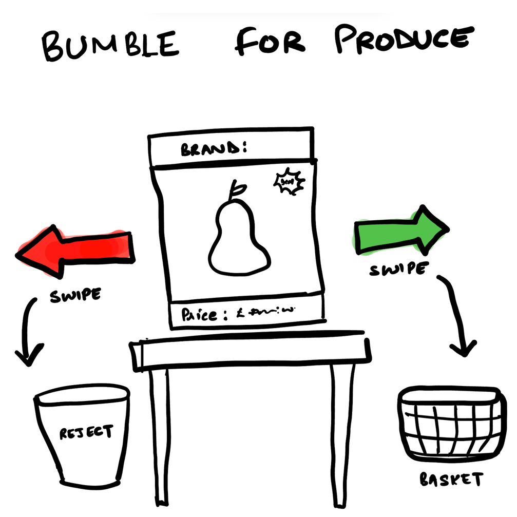
During the brainstorming phase, we explored multiple concepts. One early idea was a plant-specific dating app, inspired by platforms such as Bumble or Hinge. This concept aimed to surface human preferences around produce and plant types, helping users "match" with plants they felt drawn to.
However, during evaluation we identified a key issue: the idea centred on human preference rather than reward or reciprocity. As a result, it did not support our core design objective and was deprioritised.
"Bumble for Produce" an early concept that was explored and then deprioritised.
From this process, a stronger concept emerged. We asked: what if people could build an ongoing relationship with a grove of plants similar to a partnership that could be maintained and passed down through generations?
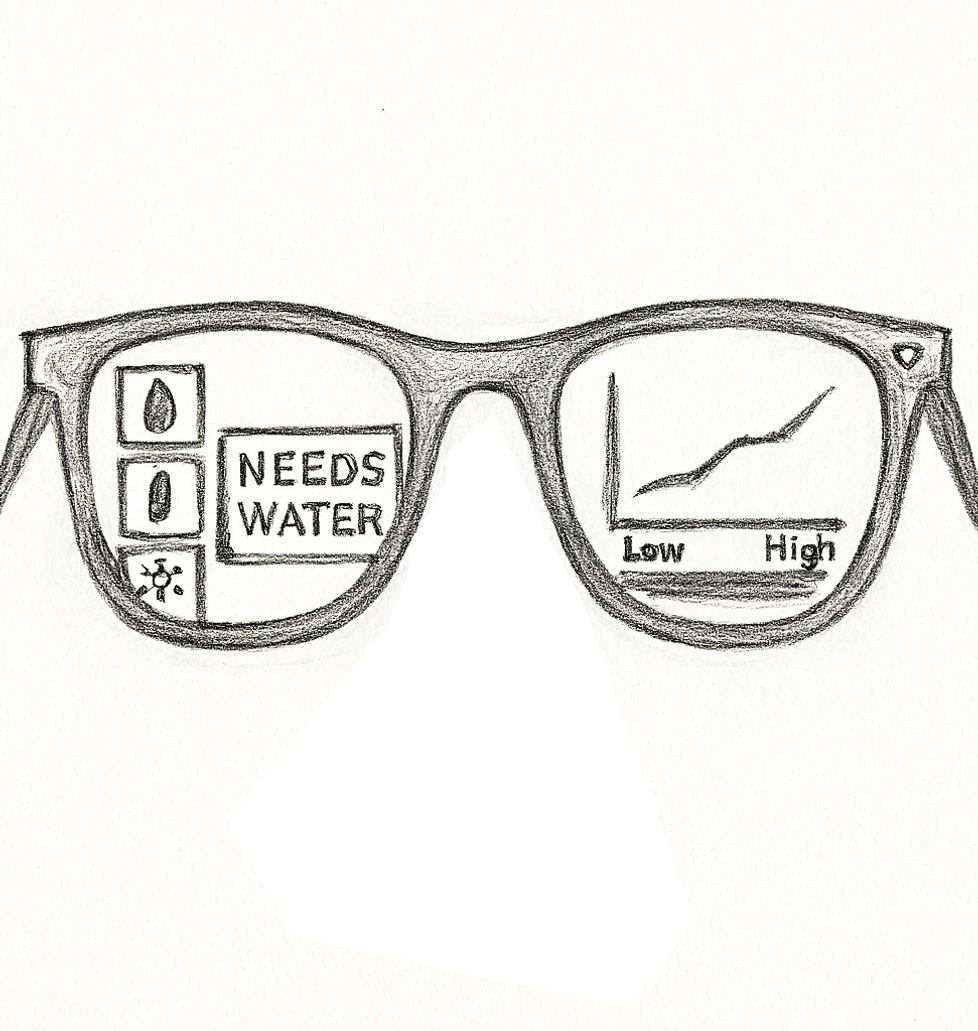
We explored this idea through a speculative interaction model using AI-enabled smart glasses, inspired by emerging wearable technologies such as Ray-Ban's smart glasses. The glasses would interpret a plant's needs in real time and prompt users with specific actions, such as watering, adjusting sunlight exposure, or removing pests.
Sketch of the AR smart glasses concept plant needs surfaced as real-time overlays.
Completing these actions would trigger symbolic or tangible rewards from the "plant," creating a feedback loop based on care, response, and reciprocity. This loop reframed loyalty as an ongoing relationship rather than a transactional exchange.
Due to resource constraints, we were unable to prototype the smart-glasses experience. Instead, we communicated the concept through storytelling and visual mockups to test the logic of the system and user understanding.
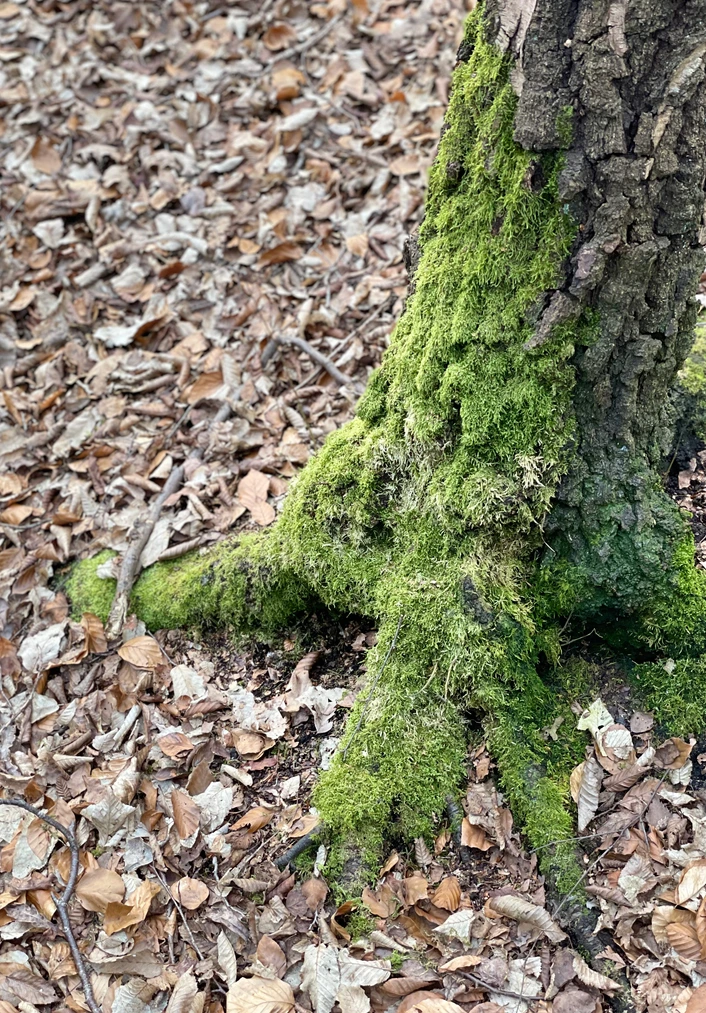
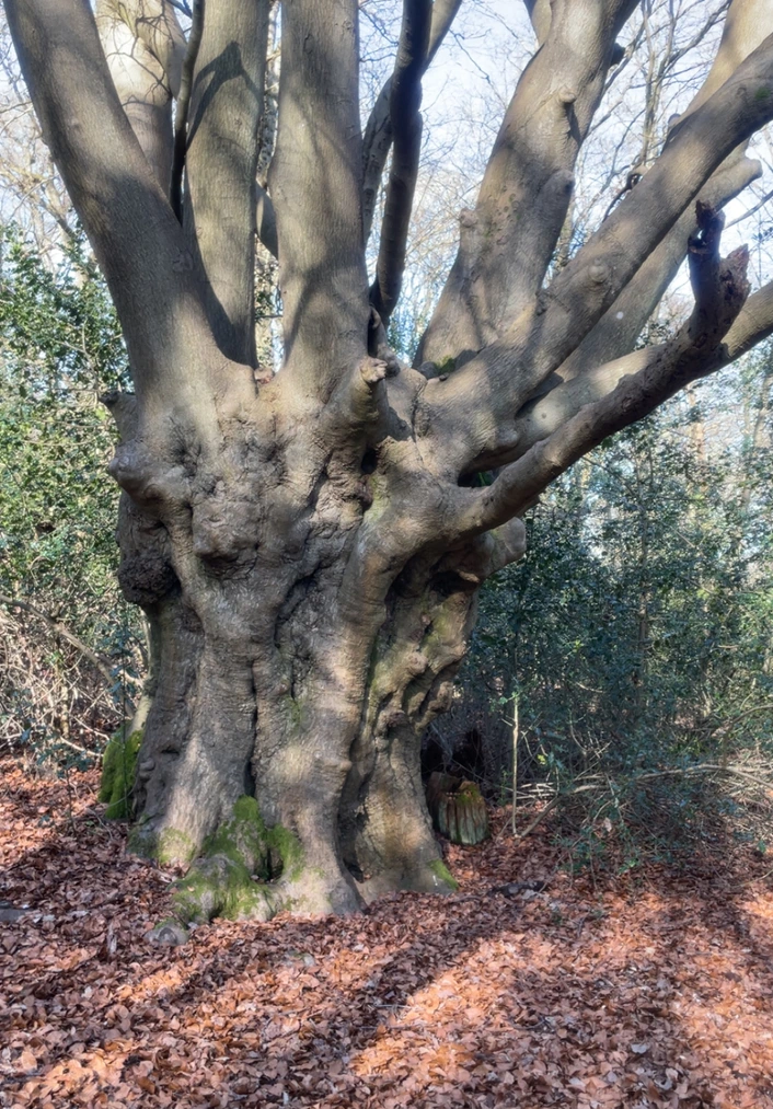
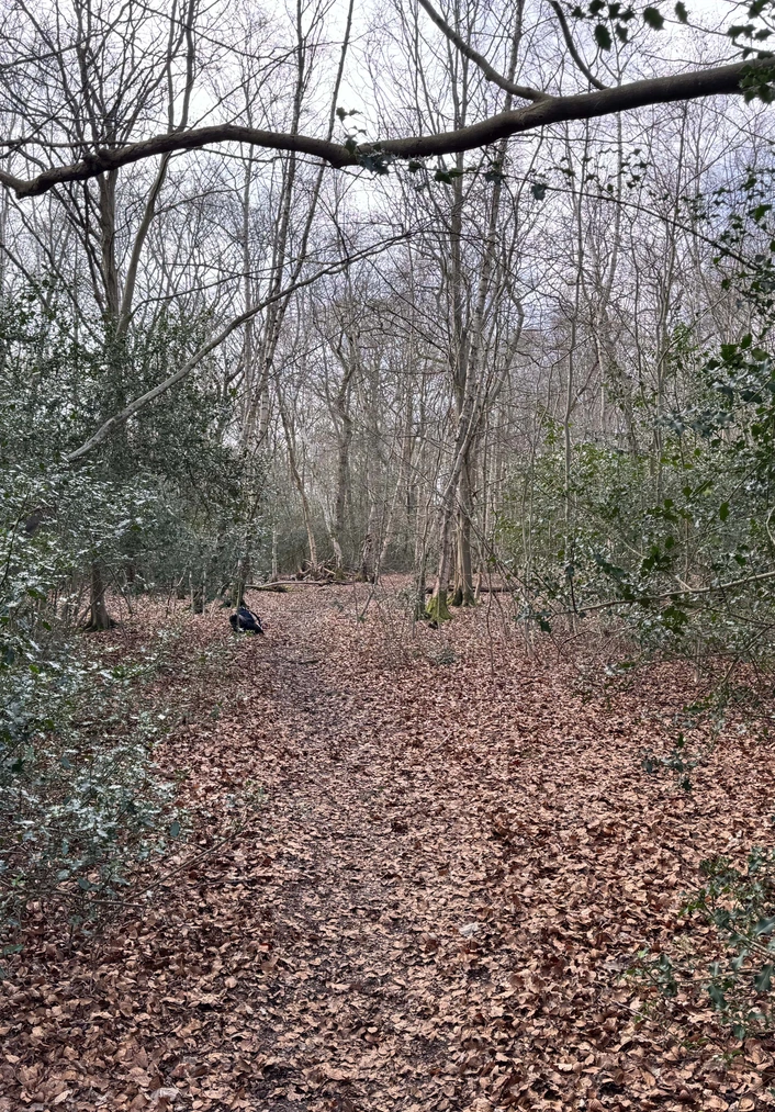
To better understand how the interaction between humans and plants might unfold, we engaged in a bodystorming session. My team and I visited Epping Forest, where we physically acted out the user journey from start to finish imagining how a person might connect with a plant grove, receive care-related tasks, and eventually earn rewards.
Epping Forest where we bodystormed the experience of connecting with a plant grove.
This immersive experience helped surface key questions around the user flow, emotional connection, and environmental context. While it gave us valuable insights, we also realised there were gaps in our concept particularly around how the experience begins, how plant needs are communicated, and how users receive feedback or alerts.
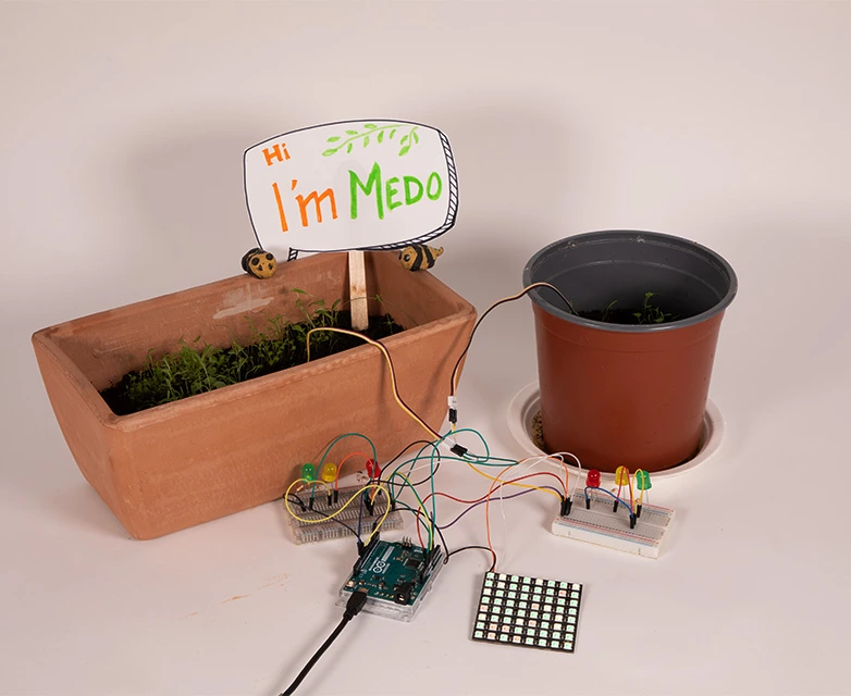
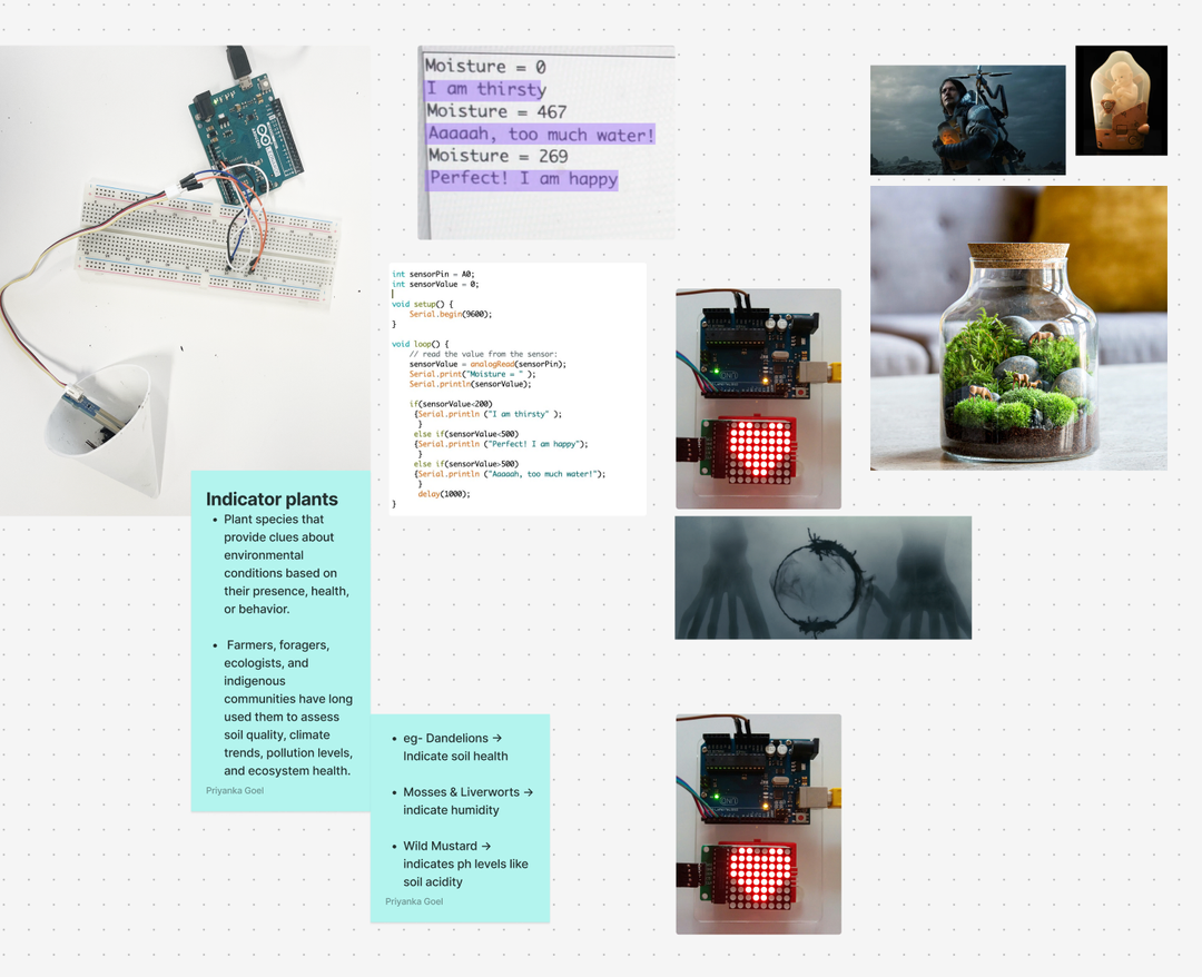
To further bring the concept to life, we prototyped a basic hardware interaction using an Arduino system. We connected a plant to the Arduino board in such a way that if the plant's conditions were off (e.g., lack of water, light), the board would trigger a red alert signal. This visual feedback acted as a notification to the user that a specific plant in the grove needed attention. While still early-stage, this prototype allowed us to experiment with real-time alerts and explore how physical computing might support plant–human reciprocity in a tangible, low-tech way.
Our Arduino prototype "Hi, I'm Medo" a plant connected to moisture and light sensors triggering LED alerts.
After multiple bodystorming iterations, we reached a clear point of view and a more structured understanding of the user journey including the onboarding process, the core tasks users would complete, and the types of rewards they would receive. Through prototyping and concept testing, we refined a loyalty experience that felt engaging, reciprocal, and aligned with our original vision: one in which plants could symbolically "give back" in response to care and eco-friendly actions.
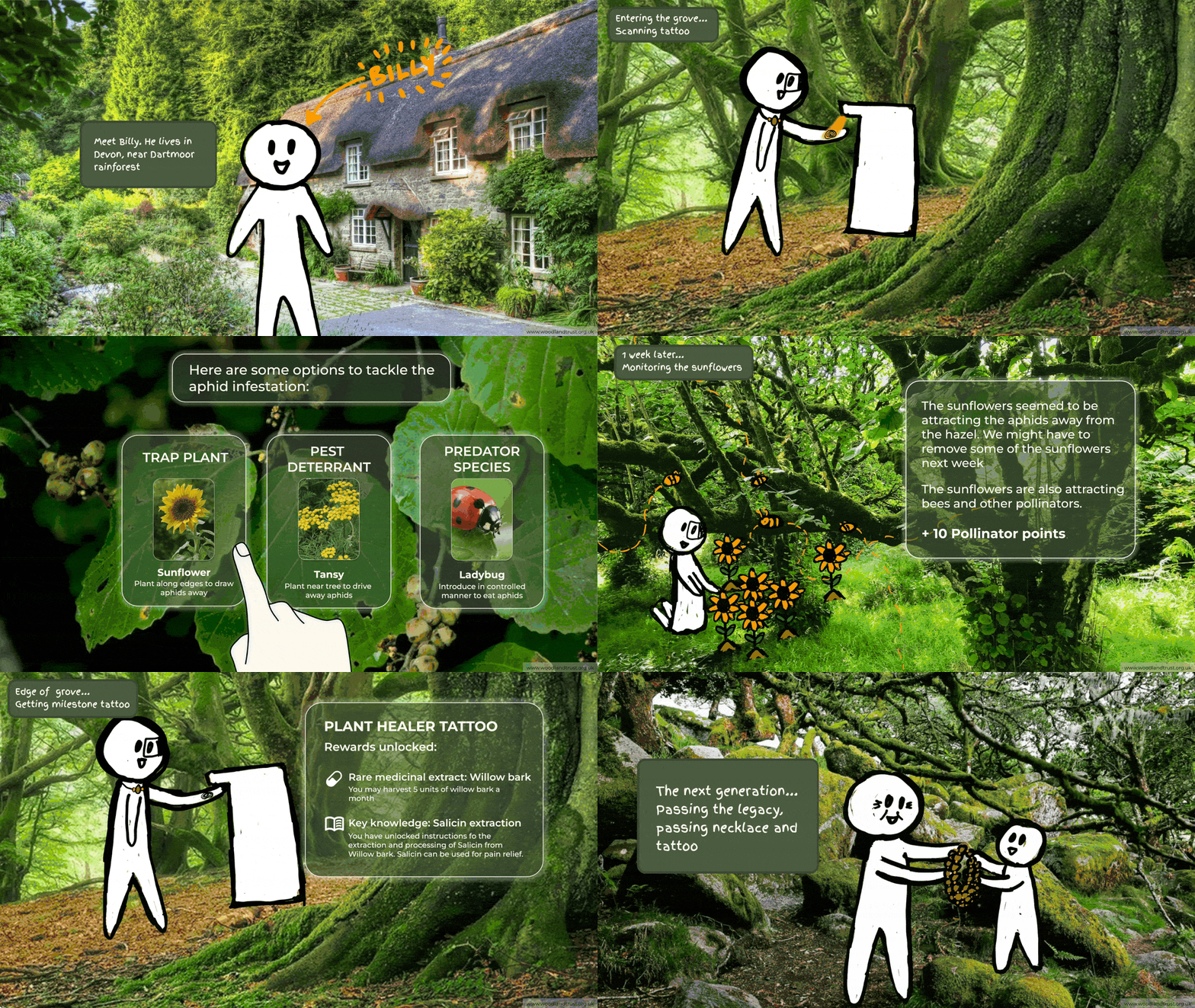
To communicate the final concept, we first created a storyboard to map out the first-person (POV) interaction flow. This helped us define the key moments in the experience: the user caring for the plant, the plant responding with a reward, and the long-term transfer of the grove to a family member.
Storyboard mapping the POV user journey from onboarding to generational handover.
The storyboard then informed the production of a POV video, which allowed us to convey the emotional, relational, and generational aspects of the experience within a realistic user context. Meet Billy he lives in Devon, near Dartmoor rainforest.
"A loyalty scheme run by plants where care and stewardship are the currency, and rewards are earned across generations."
The Oaken Circle Final POV film communicating the full loyalty experience.
I'm open to UX research roles, design contracts, and creative collaboration.
International student migration is often discussed through statistics, policy changes, and economic impact. This project explores how UX and storytelling can reframe these abstract numbers into lived human experiences helping audiences understand not just what the data shows, but who it affects.
Policy decisions around international students rely heavily on quantitative data, yet this data often strips away emotional context. As a result, the lived realities of students navigating visas, employment restrictions, and uncertainty remain invisible.
"How might we communicate student migration data in a way that surfaces empathy, emotional impact, and human experience?"
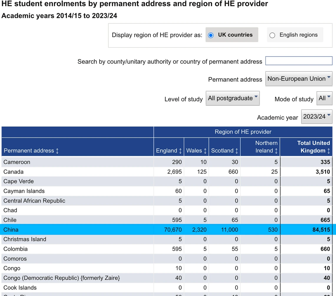
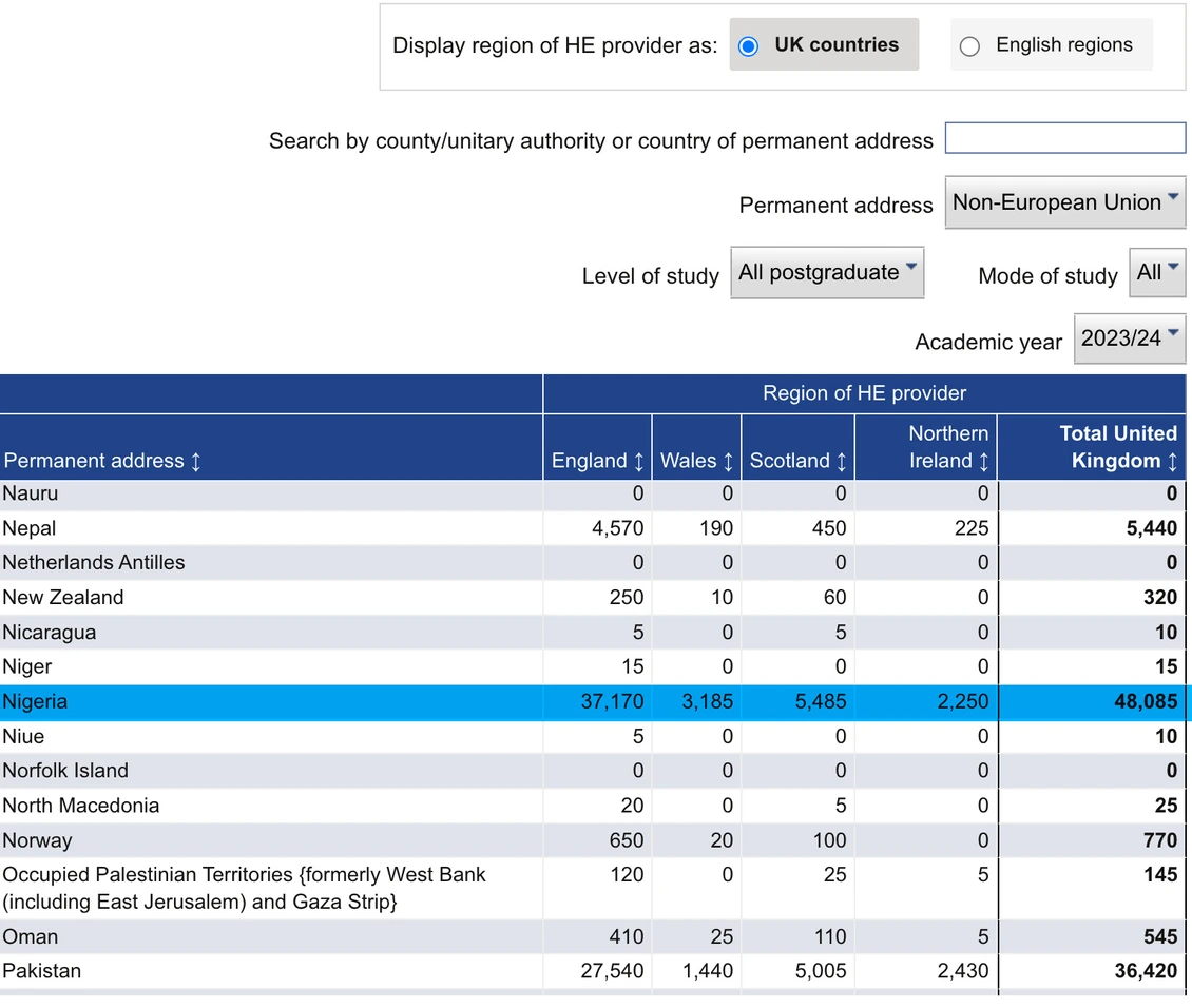
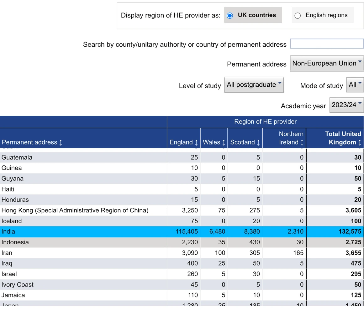
I began with quantitative research using Higher Education Statistics Agency (HESA) data. In 2023/24, 409,040 postgraduate non-EU students entered the UK. China (84,515), India (132,575), and Nigeria (48,085) represented the highest number of postgraduate non-EU entrants, making them the focus of the project.
Student visas increased dramatically post-pandemic, then fell sharply in 2023 and 2024 Source: Home Office
HESA data showing the top origin countries China, India, and Nigeria that shaped the focus of this project.
A 6% decline in international students in 2023, followed by a 14% drop in 2024, coincided with new restrictions on bringing dependants. These figures highlighted how quickly policy shifts can reshape migration patterns but they also raised a critical question: what do these changes feel like for the students themselves?
To move beyond statistics, I conducted interviews with postgraduate international students to understand how these policies are experienced in everyday life. I received consent to use students' audio and video recordings, which were edited into narrative-driven stories. Recurring themes emerged across all interviews.
Alongside video, I also captured audio-only interviews which were edited into condensed narrative stories for use in the installation.
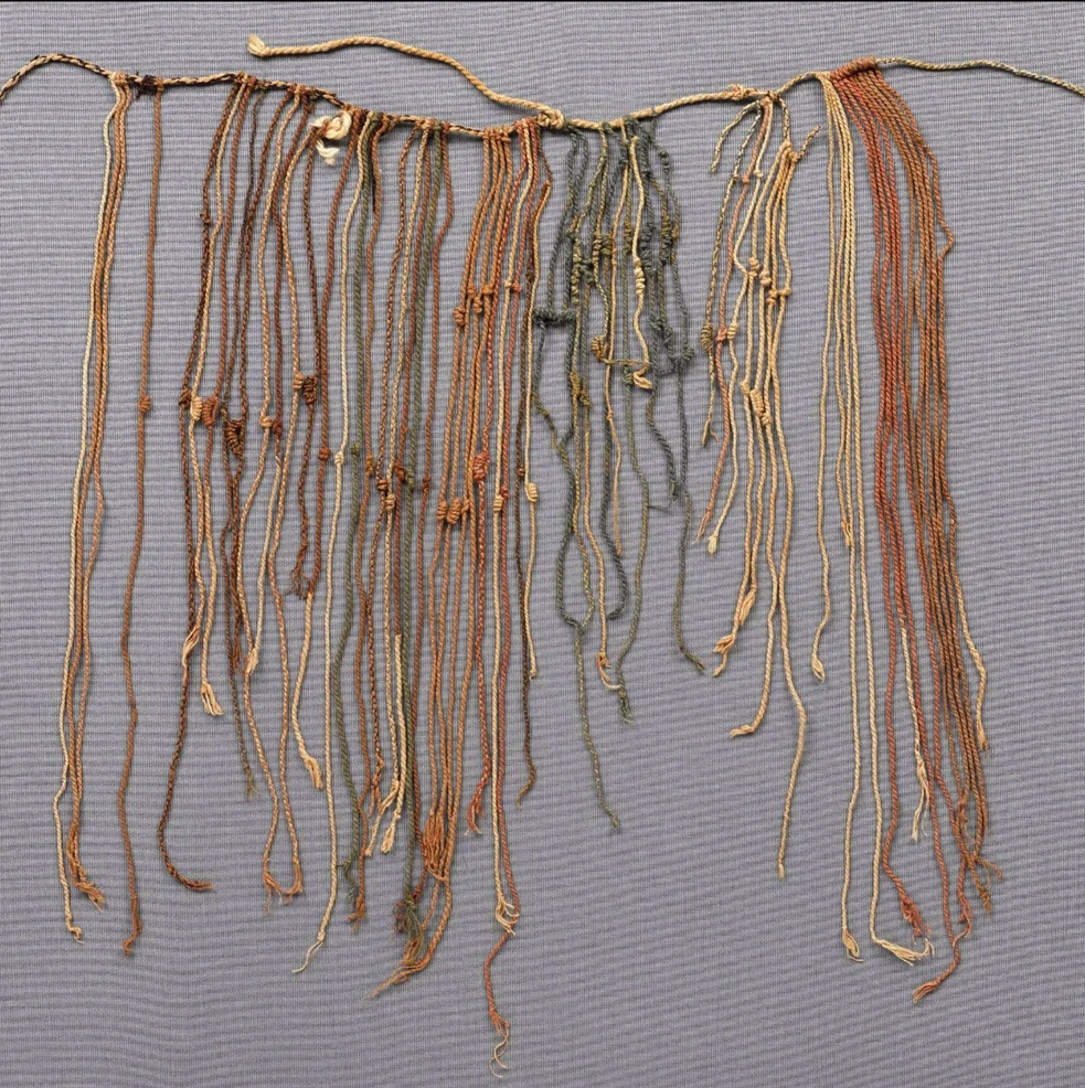
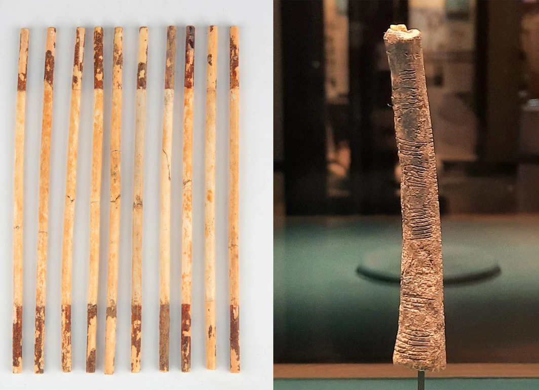
I explored historical and cultural data-visualisation artefacts, including the Ishango Bone, Chinese ivory counting rods, African bead-and-string systems, and Celtic knotwork. The Quipu (Khipu) stood out. Traditionally used in the Andes, it is a system of knotted strings used to record numerical and administrative data.
The Quipu (left) and Ishango Bone artefacts (right) historical data-recording systems that informed the concept.
What resonated was its dual nature functional as a data-recording system, and symbolic with knots as moments, decisions, tension, and transition. I reinterpreted each knot as a metaphor for human experience: uncertainty, migration, belonging, and resilience making the Quipu the strongest conceptual anchor for the project.
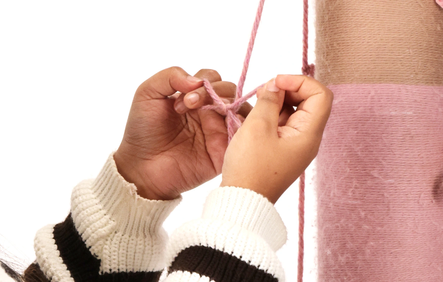
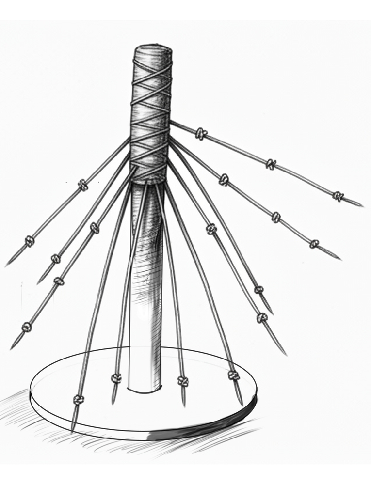
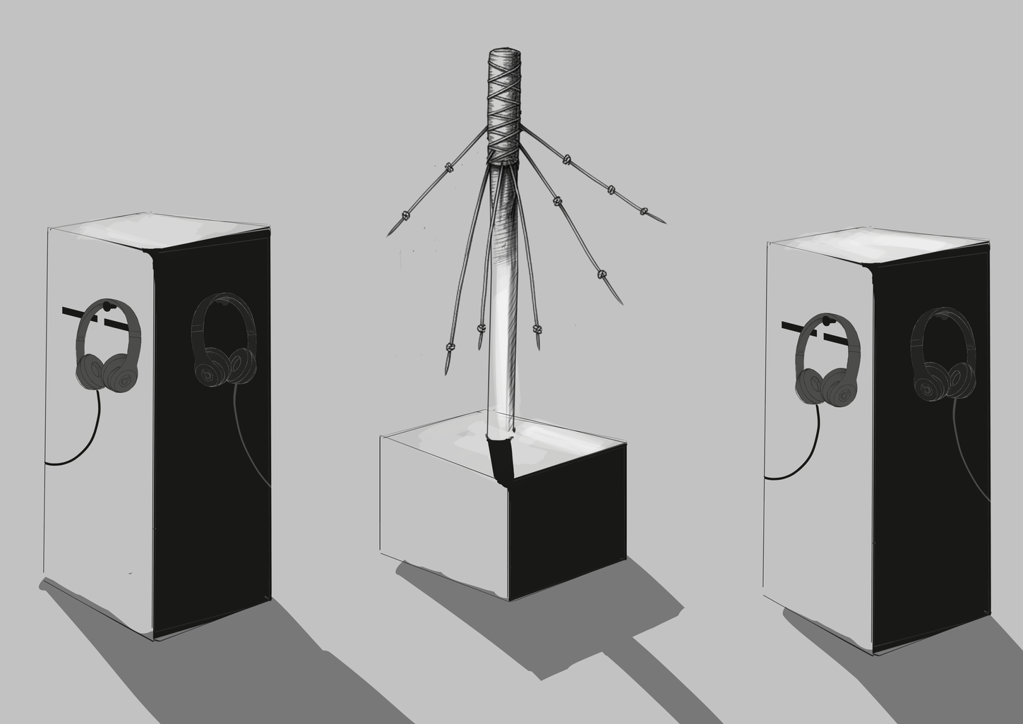
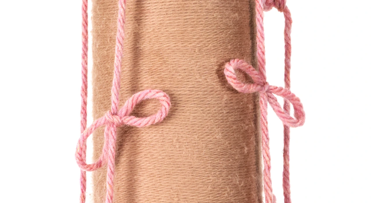
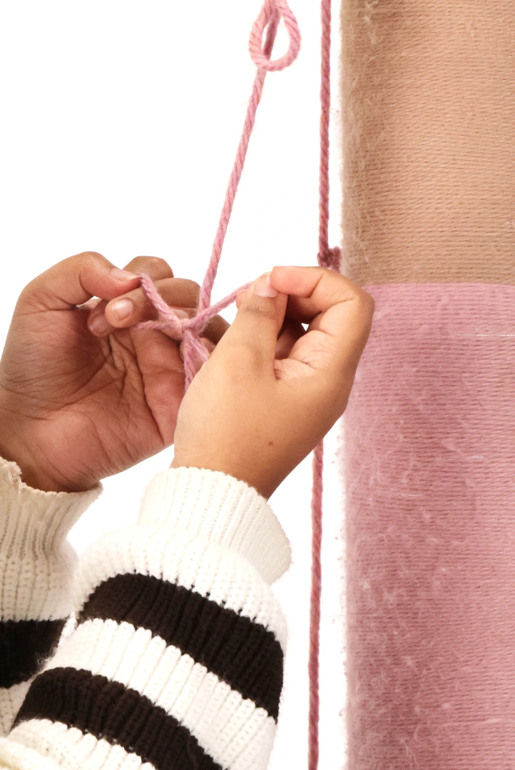
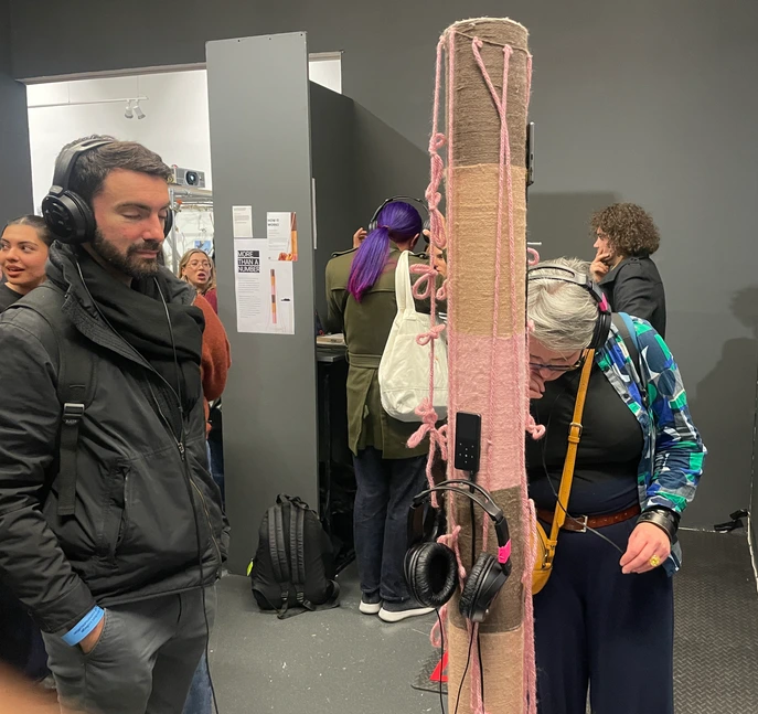
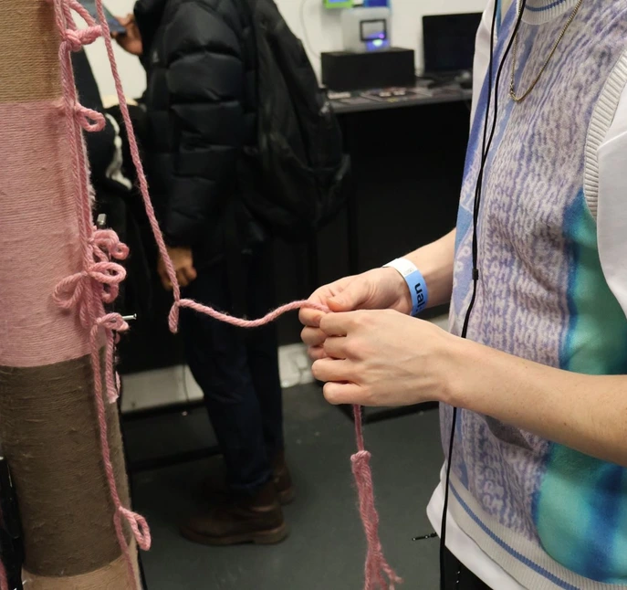
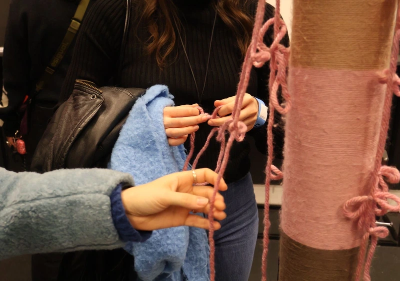
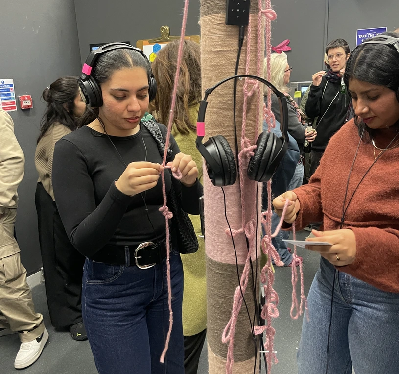
Through collaborative brainstorming sessions, the concept evolved into a physical installation: a central pole with multiple yarn strands extending outward. Each strand represents an individual student's story. Participants listen to an audio narrative through headphones. Whenever they feel empathy or emotional connection, they tie a knot. As the story progresses, the knots accumulate visually mapping emotional intensity and struggle across a student's life journey.
Early concept sketches the central pole with radiating yarn strands, paired with audio-listening pedestals.
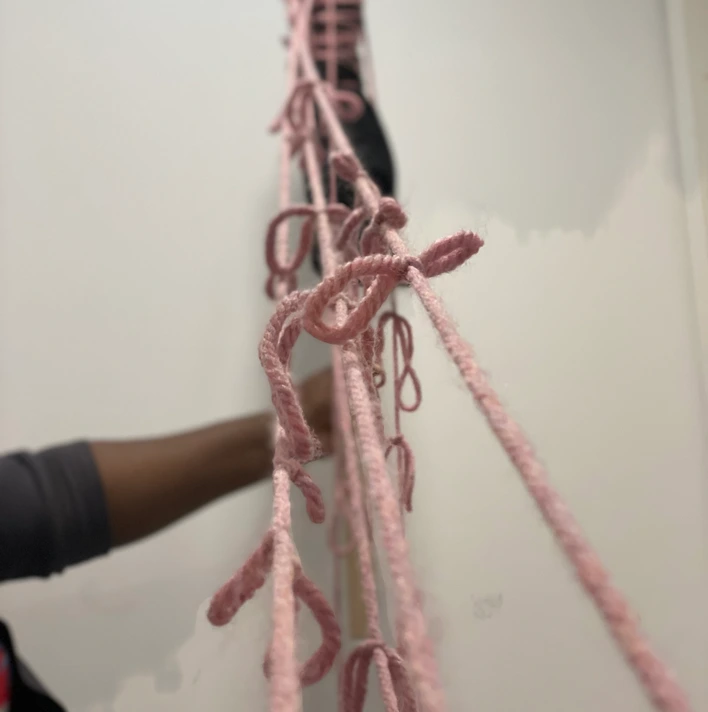
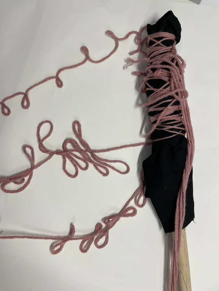
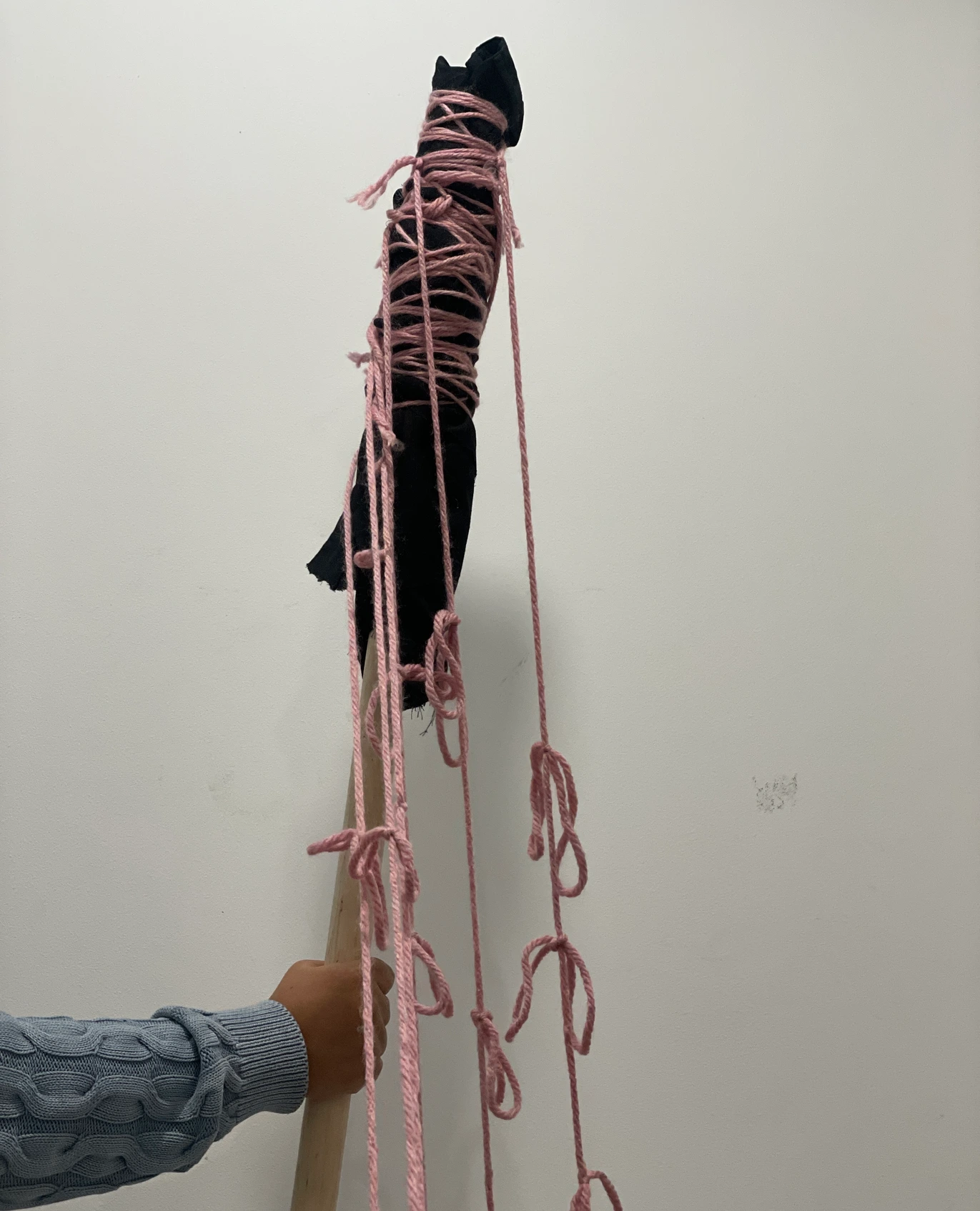
For the visual interaction, I built a low-fidelity physical prototype a wooden pole wrapped in yarn with hanging strands. Testing revealed key insights: knot-tying helped participants visualise struggle rather than passively listen; users reflected on stability and freedoms they often take for granted; and participants empathised more deeply with pressures around visas, work, and survival.
Behind the scenes building the physical installation.
These insights confirmed that physical interaction amplified the emotional power of audio storytelling. After multiple iterations, I developed the final prototype and conducted additional testing ahead of the exhibition.
Testing session 1
Following testing, I refined the installation into its final form a polished pole with layered yarn, hanging strands, and a dedicated headphone pedestal for audio playback.
Final design testing session 2a
Final design testing session 2b
Final design testing session 2c
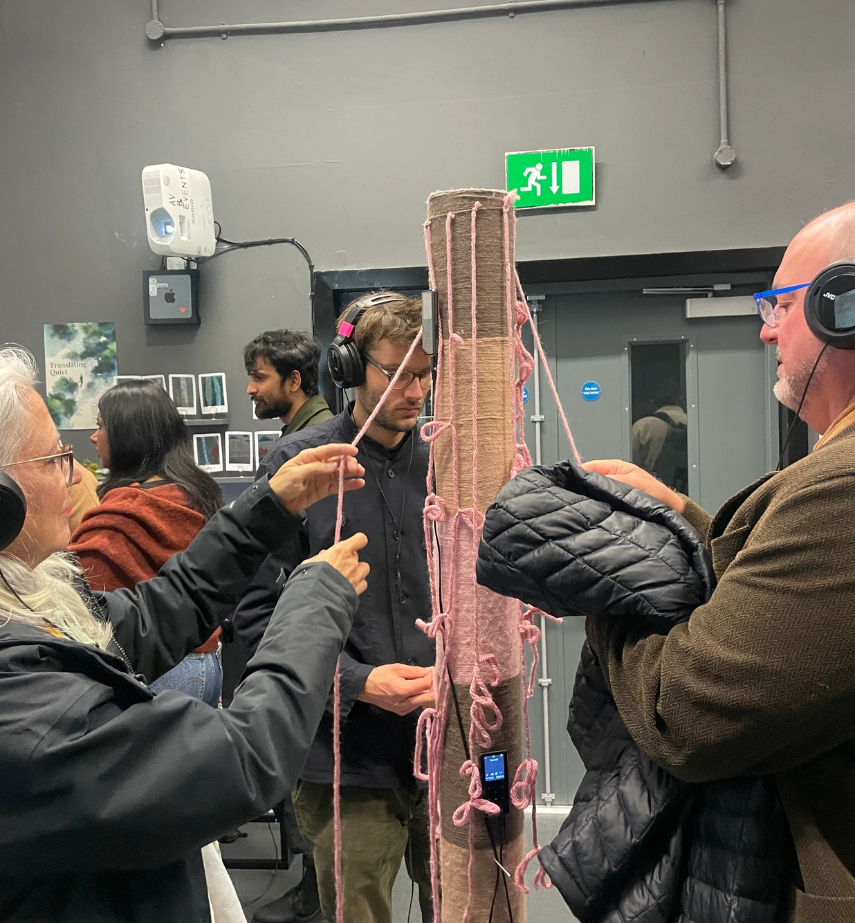
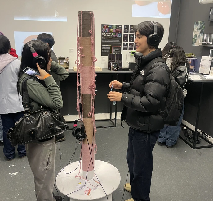
During the exhibition, participants who engaged with the piece were visibly moved by the students' stories. The combined act of listening and knot-tying consistently sparked meaningful conversations about the lived realities of international students fulfilling the core intention of the project.
The goal was not to offer solutions but to make the realities of international students impossible to ignore.
More Than A Number UAL exhibition, visitors engaging with the Quipu installation.
I'm open to UX research roles, design contracts, and creative collaboration.
Commercial advertising and brand campaigns for major global consumer brands from concept through to final art direction. Created during a contract with Noah's Ark Communications, Lagos.
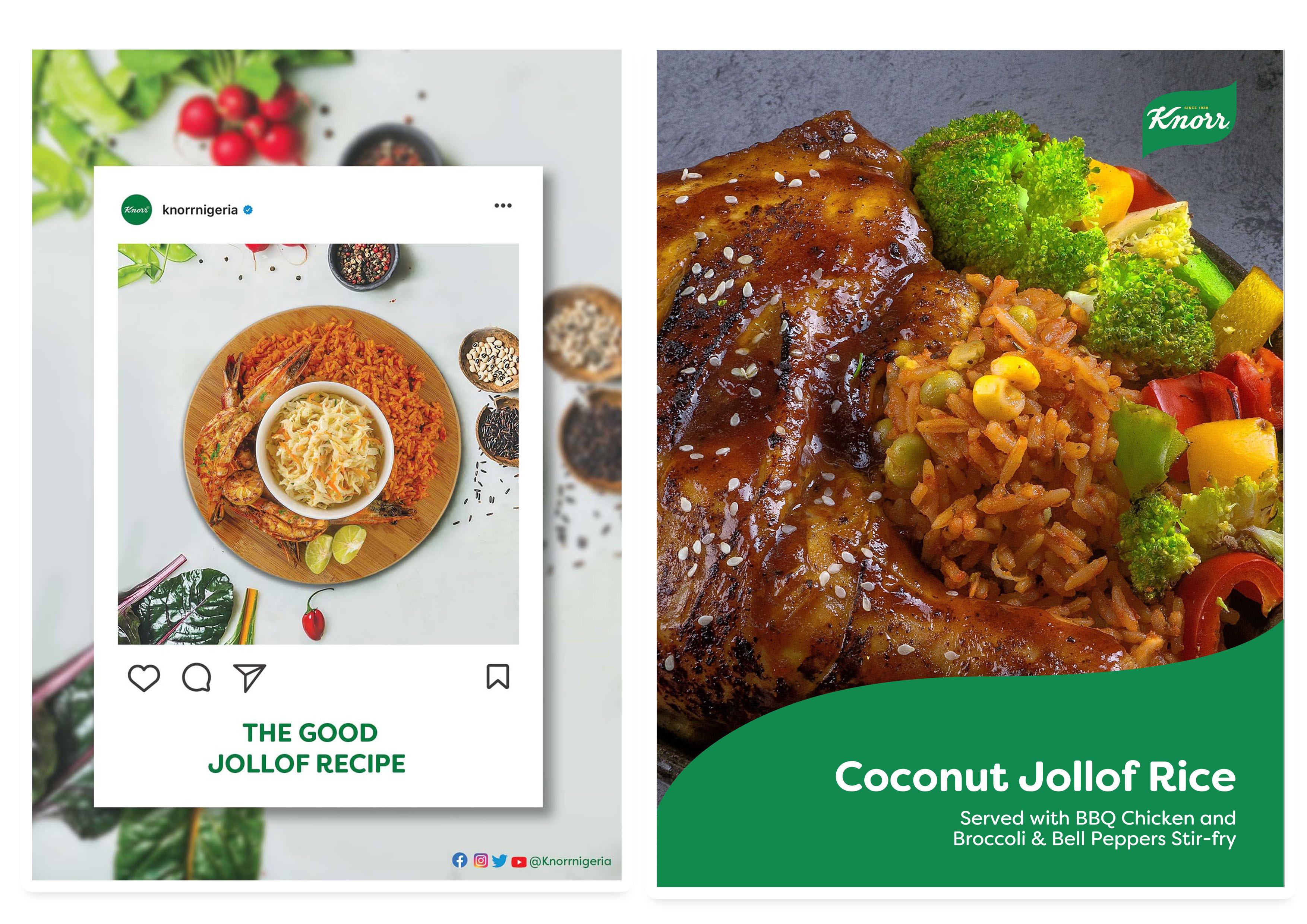
Create a campaign for World Jollof Day.
Knorr is a brand that promotes healthy eating habits, encouraging people to add more vegetables to their meals. In celebration of World Jollof Day, we created a variety of Jollof rice recipes that incorporate different flavours and ingredients from coconut Jollof to seafood Jollof to firewood Jollof. These delicious and nutritious dishes showcase the versatility of Jollof rice and offer creative ways to enjoy this beloved dish while still prioritising health and wellness.
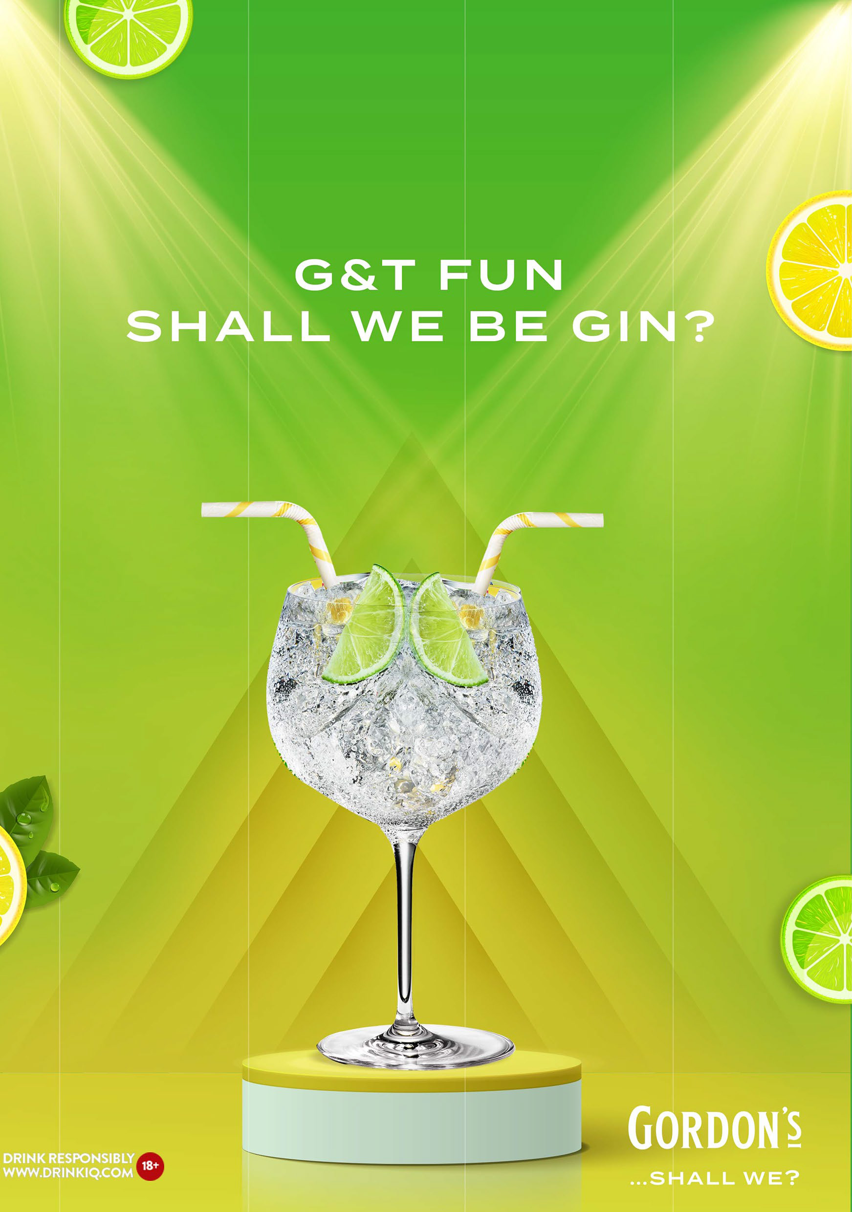
Create an ad for Gordon's that encourages consumers to express fun.
Gordon's is a gin enjoyed to start a fun weekend and create memorable experiences. Our latest ad campaign captures this spirit with the copy "G&T Fun, Shall We Be-Gin?" We believe that enjoying Gordon's gin with friends is the perfect recipe for a good time, filled with laughter and memories that will last a lifetime.
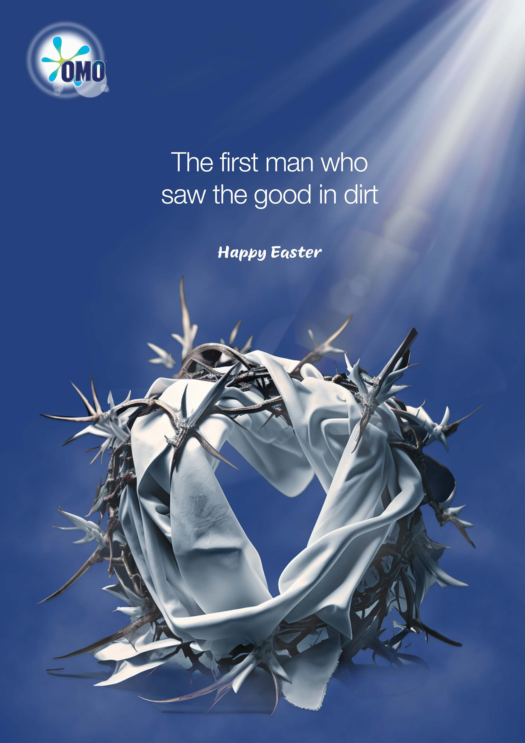
Create an Easter ad for OMO.
We explored the connection between Easter and OMO's tagline, "Dirt is good." Just as OMO embraces the idea that dirt is a natural part of life, the message of Easter reminds us that despite our imperfections and sins, God still loves us and sees the good in us. This love is so profound that God sacrificed his only son to redeem us. The parallel between OMO's acceptance of dirt and God's unconditional love highlights the theme of forgiveness and renewal that is central to the Easter holiday.
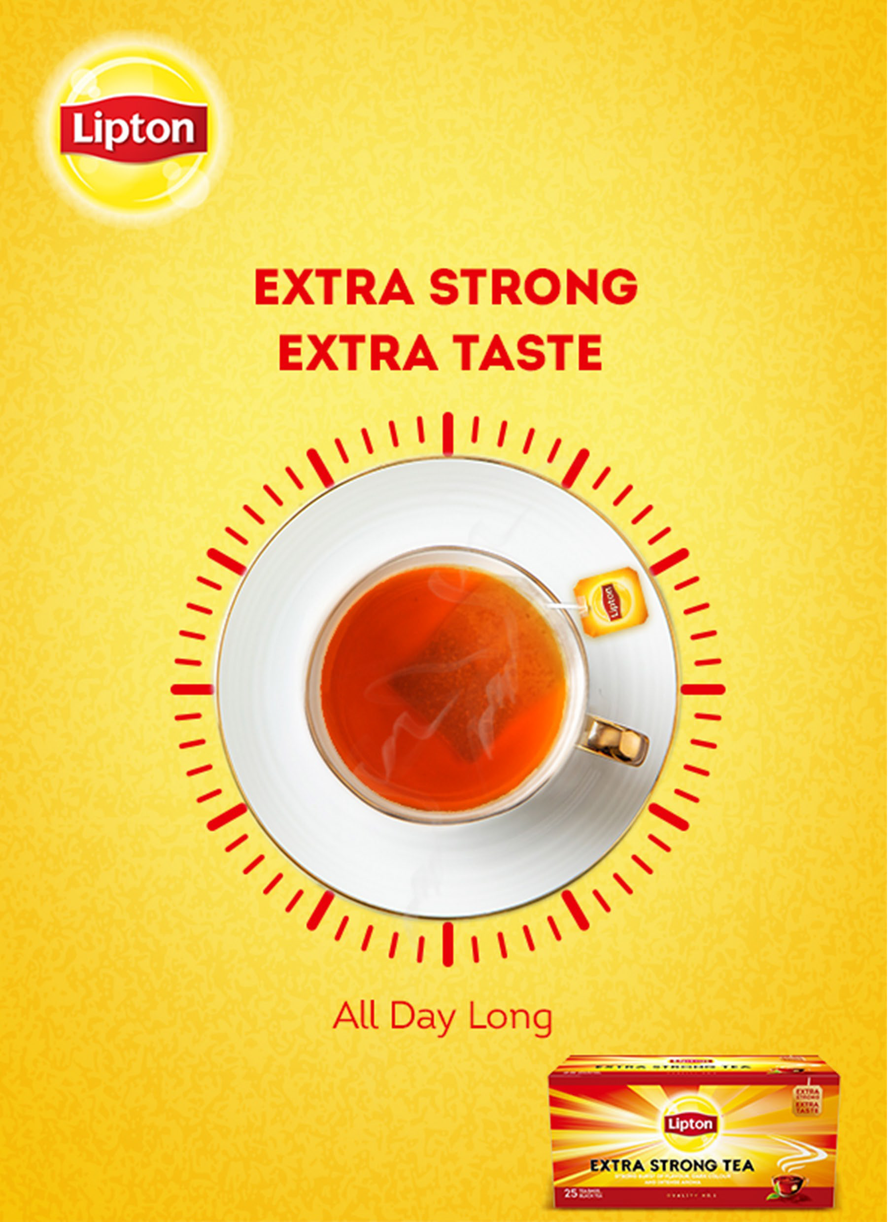
Create a key visual for Lipton's new product.
Lipton has launched a new product, Lipton Extra Strong, and we created a key visual to convey its unique selling point. The visual communicates that Lipton Extra Strong provides long-lasting energy and keeps you active throughout the day. With its intense flavour and invigorating effects, Lipton Extra Strong is the perfect choice for those seeking an extra boost to power through their daily tasks.
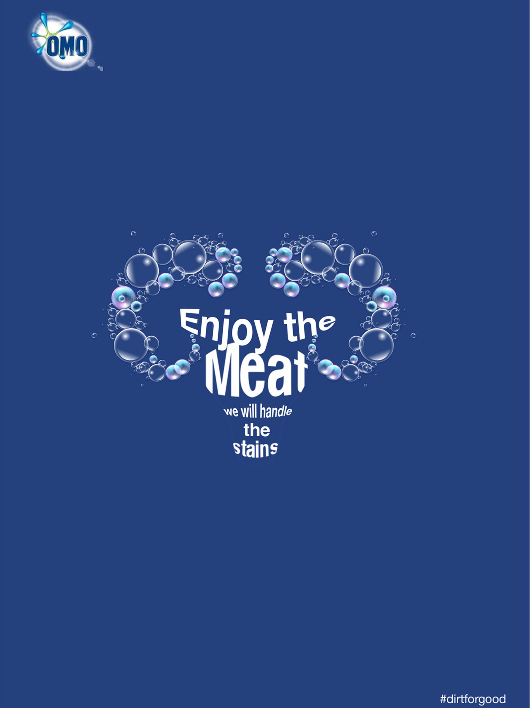
Create a Ramadan ad for OMO.
Eid al-Adha, the Feast of Sacrifice, is a significant holiday that involves cooking, sharing meals, and sacrificing animals which can result in a lot of dirt and stains. OMO's message during this celebration is one of reassurance: no matter how messy things get, OMO is up to the task of handling any stains that may arise.
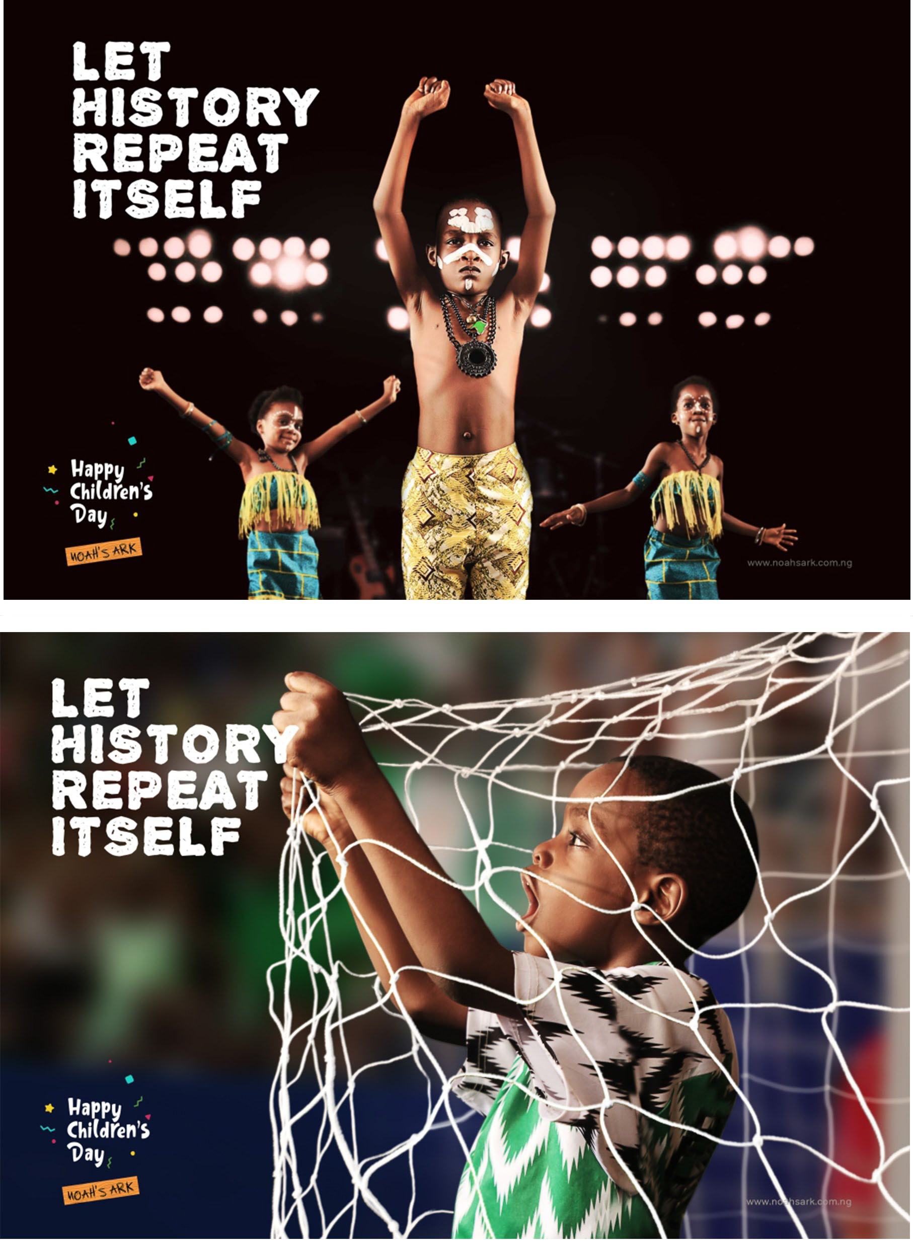
Create a Children's Day campaign for Noah's Ark.
There are moments in history we hope will never be repeated, and others we wish could be relived again and again. We remember activists who used music to fight for justice and athletes who displayed extraordinary skill and inspired generations. Fela Kuti used his music to speak out against corruption and oppression. Rashidi Yekini was known for his incredible goal-scoring abilities and dedication to sport. These individuals left a lasting impact and serve as inspiring examples for future generations.
I'm currently open to UX research and design roles, as well as creative brand collaboration.